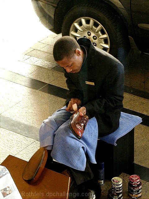
Good photo depicting a sector of the job force. Man and his craft, you might say. I don't like the washed out portion in the upper left. I still like it though.
I wish the car behind him wasn't there - what's with the paper in bottom left? The photo is too busy (IMO). If someone is sitting there, I wish we could see the shoe shiner working on 'them' instead of the single shoe. This has great clarity and I like the lighting. good job. 6 cthenk
I'd have tried this one in b/w or sepia tone to give it a different affect, I'd also crop out the paper, cropping that might also cut out some of the glare in the upper left corner as well. Otherwise a great shot, showing something thats getting harder to find.
looks like the upper left corner was editied out, see the very sharp demarcation between the light and the stones, not a gradient like it is in other places.
The bright light on the left is a little too harsh. I wonder if you could have gotten a better picture from the left of your subject. Other than that...great picture! 7 Lisa
too bad abokut the car wheel in the background and the hard light in the upper left. The rest of the portrait is very nice. I like the light across his shoulder and the sheen on the shoe.
interesting subject, and nice colors. it might have worked better if you had changed the angle to cut out the car wheel. Are you shooting through glass?
I almost like this shot. I'm not being silly it's just that there is soooo much going on here. The only real negitive I can say is the bright sun light on the left that's a distraction and looks fried. The car bothers me but I love the cans stacked on his left. Hummm, I'll have to go with a six here. Kee
I think this particular photo would hold more impact if shot from a lower angle... The overexposure in the upper right is not adding any impact for me.. = 5 - jmsetzler









 Add photograph to your favorites
 Add photographer to your favorites


