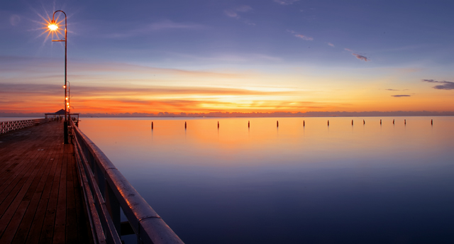
A Critique from the CC My first impression of this photo when I saw it in voting was that it had a huge wow factor and everything needed for a ribbon winner and congratulations on your top ten finish. I had this photo rated higher than every photo that finished above you. To me this has everything put together nearly perfectly. The tremendous Dof field and calm water truly give a serene feel and I also like it because it does not feel like you were forcing the viewer to look at orange and and blue like so many other entries. But I feel this can be a bit of a double edged sword on this site because so many voters want to see exactly what the challenge details are that they may knock a point down for the brown boardwalk for example. As I read through your comments received during the challenge it always strikes me that this is a contest and not an art exhibit, meaning that people want to see certain things in every photo, the rule of thirds and such.(In your specific case some voters commented that they would have liked to have seen the horizon moved up or down abit.) Eventhough I believe those can be broken, many people maybe eager to give critiques or generally feel that without seeing these rules it is an issue to be marked down on, they will take off a point here and there. So as far as composition goes I think it is amazing and I feel like thats how I would look at the scene if I was there. My only other question is why did you not use the full 150 kb size limit for your photo? I looked on your page at your other entries and they all seemed closer to the max allowance. Lastly as far as your title goes I noticed a few didn't think it was interesting enough even though I thought it fit well. The only alternative I could come up with would be "Complements of Sandgate Bay" or wherever the name of this specific pier is. I hope this was helpful and if you have anymore questions or think some of my comments are completely wrong and want to let me know about feel free to PM me. Personally I thought this would ribbon and finding things about I didn't like was very difficult for me.
A Critique from the CC My first impression of this photo when I saw it in voting was that it had a huge wow factor and everything needed for a ribbon winner and congratulations on your top ten finish. I had this photo rated higher than every photo that finished above you. To me this has everything put together nearly perfectly. The tremendous Dof field and calm water truly give a serene feel and I also like it because it does not feel like you were forcing the viewer to look at orange and and blue like so many other entries. But I feel this can be a bit of a double edged sword on this site because so many voters want to see exactly what the challenge details are that they may knock a point down for the brown boardwalk for example. As I read through your comments received during the challenge it always strikes me that this is a contest and not an art exhibit, meaning that people want to see certain things in every photo, the rule of thirds and such.(In your specific case some voters commented that they would have liked to have seen the horizon moved up or down abit.) Eventhough I believe those can be broken, many people maybe eager to give critiques or generally feel that without seeing these rules it is an issue to be marked down on, they will take off a point here and there. So as far as composition goes I think it is amazing and I feel like thats how I would look at the scene if I was there. My only other question is why did you not use the full 150 kb size limit for your photo? I looked on your page at your other entries and they all seemed closer to the max allowance. Lastly as far as your title goes I noticed a few didn't think it was interesting enough even though I thought it fit well. The only alternative I could come up with would be "Complements of Sandgate Bay" or wherever the name of this specific pier is. I hope this was helpful and if you have anymore questions or think some of my comments are completely wrong and want to let me know about feel free to PM me. Personally I thought this would ribbon and finding things about I didn't like was very difficult for me.
Alway's the Bridesmaid when are YOU going to get another top 5 finish - "you must be getting frustrated, keep Trying mate - Maybe you should take up slot car racing as a hobby?"
Oh that’s right you've tried that! Who put a stop to that hobby anyway?,
I like to refer to these people as "Handbrakes" or in your case "Maniacs"
Alway's the Bridesmaid when are going to get another top 5 finish - "you must be getting frustrated, keep Trying mate - Maybe you should take up slot car racing as a hobby?"
Oh that’s right you've have tried that! Who put a stop to that hobby, I like to refer to these people as "Handbrakes" or "Maniacs"
Alway's the Bridesmaid when are YOU going to get another top 5 finish - "you must be getting frustrated, keep Trying mate - Maybe you should take up slot car racing as a hobby?"
Oh that’s right you've tried that! Who put a stop to that hobby anyway?,
I like to refer to these people as "Handbrakes" or in your case "Maniacs"
Hate the Title - not much imagination in creation of it! - However this is truley a great image.
I would of loved to see more of the Pier it is a bit dark.
Love the complementary colour in this image (you need to win the photoshop award)
Well Done photoshop King!
This is fabulous. I love the simplicity of it and, of course, the colors. The light on the pier just adds that something extra that makes this "WOW", can't wait until I take photos this good.
nice, I would have put the horizon lower in the frame. Generaly, in basic composition, horizons should not go through the middle of your frame. Of course, I'm all about breakin the rules! But if you look at seascapes that are really good, rarely will the horizon go straight through the middle. 6
8 - Very nice. Wish it had a bit more height, but depends what was there/you had, obviously. Colors work well here, but still wonder if a tweaking of them a fraction more vivid (looks like might result in contrast/etc issues) make this even stronger, especially for the Challenge. Apologies in advance if wrong, but horizon looks like it needs a fraction nudge rotate up on the left. edit:typo
One of my favorites. Nice use of aperature to get the star from the lamp post. Can't you picture having a glass of wine and sitting on an adorondack chair? Maybe that's what you did. Nice shot. +9







 Add photograph to your favorites
 Add photographer to your favorites


 Photographer found comment helpful.


