If i remember everything here goes it.
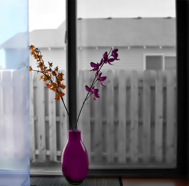
Unsharp Mask, Rotate, Crop, Hue/Sat on reds and yellows, Gaussian blur to background, Brightness/Darkness, clone out minor dust and inperfections,Neat image, Desat on background, umm.... that's all i remember :)
Statistics
Place: 94 out of 180 Avg (all users): 5.4082 Avg (commenters): 5.7917 Avg (participants): 5.1778 Avg (non-participants): 5.5419 Views since voting: 911 Views during voting: 339 Votes: 245 Comments: 26 Favorites: 0
You may not like this critique, but it is one of the best ones you will receive if you take it the proper way. "Self Critique" is a very important concept. When you enter a photo into a challenge here at DPC, it is very useful to YOU and ME if you put your own thoughts about the image in the Photographer's Comments box when you submit. Doing this benefits you in two ways.
1. If you write down your own thoughts about the image, you will know more about what to expect in the voting here. If you become critical of your own image, you will begin to understand why it will or won't do well in a challenge. You should also include why you like the image and how you feel about it when writing this 'self critique'.
2. It gives me (or anyone else who should draw your image for a critique club in-depth critique) some basic information about your goals and ideas with the photo. If I critique your image, the image itself is all I have to go on. I can write about technicals, composition, et al, but I may be writing a bunch of things you already know or realize. I would rather write about your idea or goals, neither of which I have a clue about :)
Try this on your next entry if you check the 'in depth critique' box and see if you get a better result :)
Nice, moody shot. I like the black and white background and the blue edge. I find myself wanting to place the purple vase over more to the right (two inches or so), away from the center of the window which seems to be coming up from the center and competing with the flower stems, dividing them.
Sorry but the afterwards blurring is very obvious and just looks awful, the shot just doesn´t look real somehow, if you are going to do blurring afterwards, take more time and don´t leave any traces of it, there are very obvious lines around the flowers that give you away, that and the unnatural bokeh. Just use a bigger aperture next time and save yourself some work, just do it in camera.
I like the selective desat... good color and composition... love how the curtain breaks up the centered composition creating tension in the photo... well done!!
looking at this photo a couple of times now and I can't really tell what to think about it. I like the ordinary way you've done this (just the "Ordinary Neighborhood Window" ;)) but I think that's really the point. sometimes it's nice to see something not so ordinary, you know what I mean?
I might come back to edit my comment, because this might sound a bit negative, and that's not what I want you to think, because there's just something about your entry..
Nice idea. Very interesting mix of sat and desat. Just fyi, you have some post-processing boogers near the purple flower - can see the unblurred background near the petals and the stems. (I have trouble getting this kind of stuff to be clean too.)
I know we couldn't control everything seen through the windows we picked, but the house behind sorta detracts from the rest of the picture. I like the fence, but not the house. I also personally like selective desat, but there are lots on this site who do not (so fair warning). The dual colored flowers split by the vertical bar is a nice touch. I'm not sure I would have left the glass? on the far left in color. 6
sorry, but I think this is a bit over-processed and I don't care for the composition (especially the window frame coming out of the center of the vase) ..





 Add photograph to your favorites
 Add photographer to your favorites


 Photographer found comment helpful.


