For a photograph this is very flat. There doesn't appear to be much tonality at all. Might be ok for other applications but for DPC you'll probably want to try and have as much depth to the photo as possible. Just my opinion though.
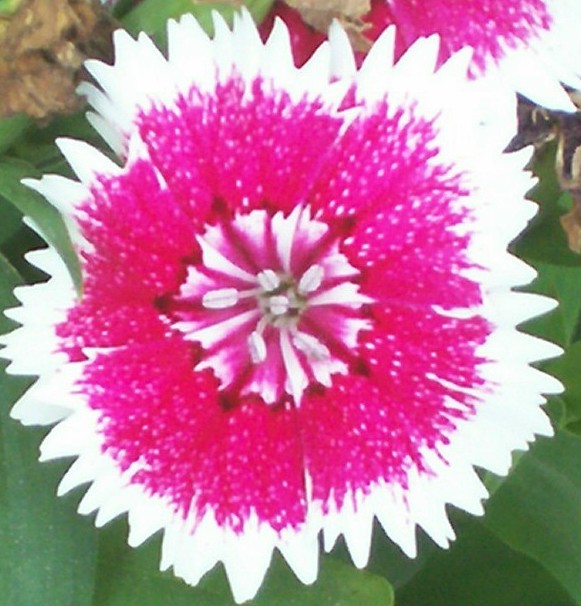
Image is way overexposed along the edge. It is also very out of focus, though it appears some of your background leaves may have gotten the best of the focus. Color is off as well. Having a higher shutter speed, or even compensating your exposure to underexpose will help. Also if you have the capacity to do a white balance reading on the camera before shooting, often that will color correct for you.
focus could be much better, and you could have adjusted the colors to fit the challenge better.
you need ALOT of work on focus and light actually... 1.
2 - Don't mind the close crop, but the quality needs to be there. Not sure what you've done pp with this but it appears totally flat and void of detail. Color-wise, bordering on red, but not strongly enough in my opinion, although I realise that this flower may have been more red in person, but you haven't captured that, especially with the processing. For this Challenge, perhaps tweaking in pp may have helped you, but you'd still be left with the quality issues.
Focus, please! The picture is also overexposed (white petals have no detail, green leaves are washed out) and tahe overexposure also gives the main flower a merge with another in the background.





 Add photograph to your favorites
 Add photographer to your favorites


