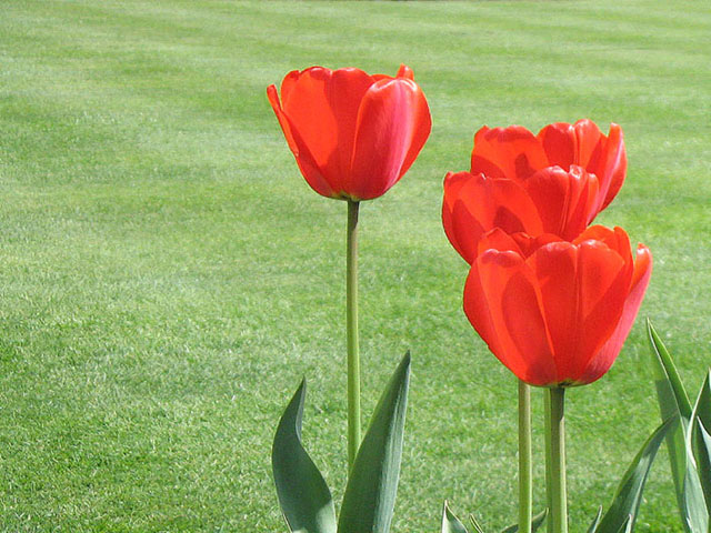
the contrast of the colours are really nice, particularly with the use of the green 'negative' space. I fear that this pic & other flower pix will not fair as well in challenges. Noetheless, good luck in the voting!
You definitely have met the challenge with this red/green combo. I like the composition although I think some miht say that you have broken the ROT with the tulip that has been placed in the centre. For me, the high contrast light is working against you here. The lighting makes it difficult to see and enjoy the details of the tulips and you are getting a ton of reflection from the grass, so it doesn't look as green as it could have. Depending on where the sun was, a polarizer might have helped, but earlier or later in the day would have helped also. JMO.
5 - Nice. Like the simplicity and use of grass as background. Seems to be an issue with grain, but perhaps it is a consequence of resizing/etc, who knows. More detail/sharper in the tulips and the reds more 'controlled' (looks slightly blown in areas) and a more refined crop, make this even better in my opinion. edit:typo
the background is a real distraction for me...maybe this is a point and shoot camera without much depth of field...maybe a closer shot of the three closest flowers would have given a more out of focus background and really lifted the shot







 Add photograph to your favorites
 Add photographer to your favorites


 Photographer found comment helpful.


