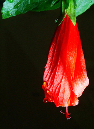
One of the reasons I didn't enter this challenge was because I was not creative enough to think of a picture that exhibited complementary colors and didn't involve a flower... I see that you too have failed at at least one of these, but a nice picture none-the-less. 6
3 - Potential looks like it is there. Bigger (640 height), variation in lighting, sharper focus, more depth and better control of the reds make this much better in my opinion. Background is grainy and also dominates too much in this shot. Like to see the detail in the flower and petals and more leaves/green incorporated too. Composition is quite good. Up to 3 from 2, because it looks like you put some though into the arrangement/composition and framing.
Simple. Quite lovely and the colours balance each other enough to be called truly complementary, but both of them are chiefly played off against the black.





 Add photograph to your favorites
 Add photographer to your favorites


 Photographer found comment helpful.


