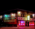
I can't see your camera settings, but the first thing I thought was the picture was noisy. It might actually just be the way the brick is on the facade.
A few thoughts:
1) The color is very drab. I usually recommend that we switch to black and white in situations like this. The color is giving us nothing and is probably dragging us down.
2) The composition is very static. The building is quite centered and it's a typical "off axis" presentation of a building.
3) The brick, as mentioned above, either didn't capture well because of the light, or the processing or something. It looks very muddled and not contrasty enough. You need more contrast to the picture. |








 Add photograph to your favorites
 Add photographer to your favorites

 Photographer found comment helpful.


