Well I'm sure this got quite a few comments telling you how you shouldn't take a pic showing the name on ahead stone. Commenters were quite vocal when I entered a pic of my nephew's ;)
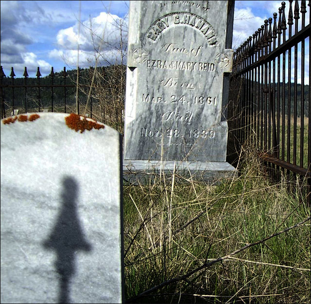
That said...I like the lower angle, but the stone taking up the lower left corner takes away from the impact & the sky looks too bright a blue & not quite real. I probably would have toned down the color or went sepia or B&W.
The tombstone in the foreground with its blowouts and that shadow draw my eye completely away from the much better background. The sky and the right side of the fence are my favorite parts of this image. I would give this a higher score if the image were of just those three objects: The tombstone in the back, the fence, and the sky.
Stone in left corner pulls away from the stone that is in focus. Really distracting. Composition with the fence, stone that is in focus could have been really nice if the one in the corner were not so overwhelming and distracting.





 Add photograph to your favorites
 Add photographer to your favorites


 Photographer found comment helpful.


