| Author | Thread |
|
|
04/30/2006 03:26:43 AM |
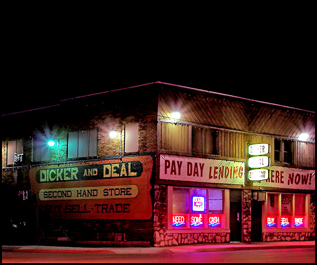
AW, you got robbed a little bit here IMO. I think this should've been in the mid-5's anyway. I actually quite liked it myself.
I don't agree with the suggestion to crop out some the black; I think that oppressive weight of black is integral to this. Hell, I might even ask for more... What I WOULD like to see you do is rotate this so the corner of the building is vertical. That would help a lot. I'd like to see a little more ont he right too. I might like to see it with a faint misty/glow overlay also.
Anyway, good shot and a nice try!
|
|
 Photographer found comment helpful. Photographer found comment helpful. |
|
|
04/30/2006 02:58:52 AM |
|
I like it though I agree with hideout. Beside the crop I wouldnt change a thing. |
|
| Photographer found comment helpful. |
Comments Made During the Challenge  |
|
|
04/25/2006 12:30:43 PM |
|
Creative take on "old". I might have cropped just a bit off the top, the black negative space with the lack of stars or any atmosphere does not fit. |
|
| Photographer found comment helpful. |
|
|
04/22/2006 04:08:20 PM |
|
This meets the challenge well for me, but it's too much. Too much gaudiness and I'm not crazy about the red overtones. Sorry... |
|
| Photographer found comment helpful. |
Theme:
Classic /
Light /
Dark
Home -
Challenges -
Community -
League -
Photos -
Cameras -
Lenses -
Learn -
Help -
Terms of Use -
Privacy -
Top ^
DPChallenge, and website content and design, Copyright © 2001-2026 Challenging Technologies, LLC.
All digital photo copyrights belong to the photographers and may not be used without permission.
Current Server Time: 10/12/2026 06:06:29 AM EDT.







 Add photograph to your favorites
 Add photographer to your favorites


