Taken in Kerrville, Texas, outside the hotel we stayed in for the Easter Hill Country Tour, which is a bike ride. On the second day of this bike tour, one of my riding partners said "Hey, I just figured out what the "H" in EHCT stands for - hills!" On the first day, we'd hit a downhill where I finally resorted to tapping the brakes because the bike started to get a bit wobbly - when I checked later, my max speed was 40.1 mph on that hill... always best not to know that sort of thing at the time.
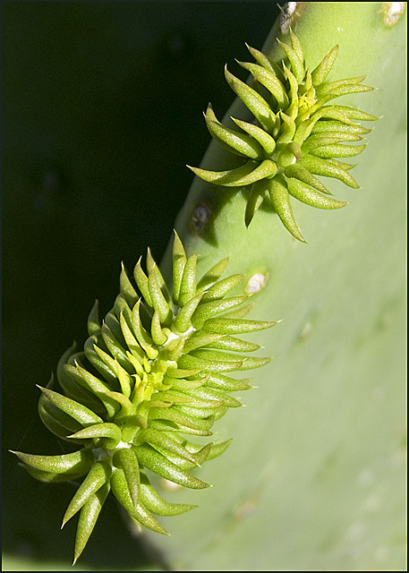
Cropped, rotated, flipped horizontally, cropped again. Curves, hue/sat, bit of burn on the lit side of the parent plant, tweak in exposure offset and gamma, USM, resize, USM again.
Statistics
Place: 85 out of 247 Avg (all users): 5.5647 Avg (commenters): 6.6000 Avg (participants): 5.4118 Avg (non-participants): 5.6203 Views since voting: 799 Views during voting: 335 Votes: 255 Comments: 18 Favorites: 0
Sorry, this is gonna be a stream of random thoughts rather than anything proper. Struggling to catch up last entries before rollover. Will be better next week :)
Technically good macro, the black vs green b/g works well. I'd prefer to see some more dramatic lighting, to give a bit more contrast - maybe lighting from the other side so shadows on the right could echo the black b/g on the left for example.
dof is good, but the lighting on the right hand side is quite flat, so the effect of the dof is not so noticeable because theres not much texture shown
i personally thought this was a great shot. i liked the division between the seen and unseen. i love the dof, with spot on focus. and i like the subject.
i dont think it is appealing to most dpc people though. all green. no colorful flower, no spectacular rainbowed caterpillar eating away at it. that caterpillar part was a bit of a joke. sorry.
this is a nice image, but I think it would look even better if you would crop it so there would only be the bigger bud in the picture, this is well lit, focus is good and it fits the challenge perfectly, I think it's a bit oversharpened though.
I really like this image. I think you've composed it wonderfully; the placement of the buds adds much interest, and your decision to leave a large dark portion intact in a way that intersects the image on an almost perfect diagonal gives this an abstract feeling that satisfies. This is further enhanced by the depth of field that drops off, almost precipitously, from the edge of the leaf down. A wonderful composition.
I perceive that some may be distracted by that large dark area. I really love it; I think it works great. I see spots on the underexposed leaf within this element, making me want to inspect that area more. Elements that make you work your way carefully through a picture are always good, in my opinion.
Lighting and focus are perfect for this image.
Overall, a great effect that I really enjoy. Thanks!
The only thing that you really gotta work on here is the composition -- the same things that apply in other types of photography still need to be applied to macro.
This is a good macro. I like the diagonal composition and the light/dark divide that it creates. It's hard for me to say how I would improve on it (first of all, I probably couldn't improve upon it, but that is a skill problem I have to deal with). Perhaps if the dark were a little darker, there would be more 'punch' to this shot. The focus is certainly sharp and the photo is well done. (BTW in the first instant I saw this shot - before I recognized what it was - I thought the little critter was following the big critter. LOL.)
I think this has excellent detail, very crisp. The white tips give the indication that this could hurt when it matures, but not quite yet. The DOF is excellent. I did vote this a 6, and the reason it wasn't higher was it just didn't capture my attention for long enough.
I like this shot a lot! It has strong composition and a subtlety to the colouration that I find relaxing an engaging. However, as has been noted elsewhere, because it is not more "out there" in terms of contrast and saturation, unlikely to be a firm favourite for the "pack".
This would have gotten an 8 from me if I had voted (so why didn't you? I hear you ask...)
Well seen and well composed capture, but I think that your lighting is lacking just a hair. While the dark v. light works as a nice balance, I donlt think that the light is light enough or the dark is dark enough. I copied it and messed with it a hair in PS. I added a curves layer and added two points. The top point I set at I:181 O:199 and the bottom at I:70 O:56. It added a nice contrast to the shot, but that's just my opinion.
I like the diagonal, and I like the dark vs. light. There is some little thingy on the left that I would either like to see just a little better or not see at all. The greens are probably very accurate, but they make me think "pea soup" right off the bat. I think it would have helped to use Hue/Saturation and possibly generate a little more punch. I could be wrong, but that's my thoughts. Love the composition!
Hmm, 17 votes UNDER 4? LOL, gotta laugh! Very new looking buds, so think it meets the challenge fine, and I think it is a very well done photo, did not vote on it, probably would be in among the 85 if I had! Only thing it lacks to me is contrasting colors, and I understand that is the way it is, but just a little bit of red/blue/yellow or other color would have helped out quite a bit, IMO< only, we know!!! lol
Wow! Those prickles are seeming to come right off the screen! I love the depth of field you've chosen it makes this look so 3-dimensional. Amazing photo!






 Add photograph to your favorites
 Add photographer to your favorites

 Photographer found comment helpful.


