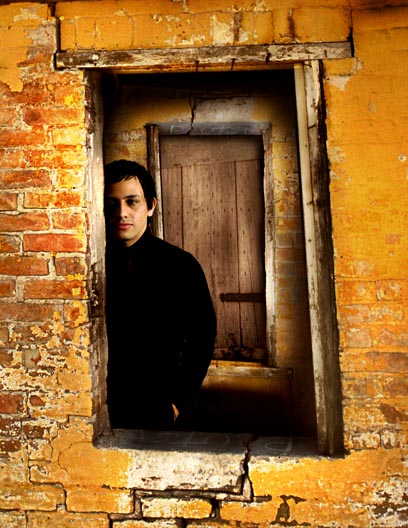
I love the way the window frames the door and the lighting is really well done, I don't know if it is natural or done with flashes but I like how it is lit.
HI from the Critique Club. Here is the critique you requested. Please feel free to pm me with any questions or comments.
First let me say...This was one of my favorite photos in the window challenge. I think it is well done, interesting, and shows skillfull postprocessing. So, i dont have much in the way to offer from a critical standpoint but here goes...:)
Composition: As i may have mentioned during the voting, the crooked framing of the windows is appealing. Gives the picture a otherwordly look. I assume the building is crooked, and that it was not caused by camera angle. Great composition.
Lighting: LIghting is nice and the only nitpic here is just that the black shirt/jacket is totally devoid of detail. I think just a hint might have improved picture slightly. Very minor IMO. Lighting on the faces is perfect BTW.
Post processing is well thought out with my only suggestion to be a slight darkening of the door behind the man. it seems rather light considering it is the interior of a building. Would have given the picture an even more mysterious feel.
I dont think i can add anything else. This is a very cool pic, well planned and executed. Self Portrait?? Good job and congrats on your high finish.
Very cool, like the processing int his one and the composition and the door makes this seem to go on forever, like if he were to step through the door he would end up in a room exactly as the one he was leaving. Strong image, gave it a 9.
You found an amazing location for this challenge. It is most fitting. I think it would have worked a bit better if the model was not as close to the front wall. I like that you are showing only half of him though. The tilted frames add nicely to the dynamism of the leading lines.
Could be a very strong composition, but I'm not convinced by your model, whose expression is a little bland here. I'd have perhaps burnt in your outside wall a tad to focus attention inside the window. The focus appears to be on the outside wall and not on the subject.
Love the colours, the textures of the worn surfaces and the door behind the window. Something about the edges of the window feel way too soft - the detail isn't there and it feels kind of odd. I like the partly hidden pose though it's a little forced.
I like the depth of this image and the colors are nice but not too much to distract the viewer from seeing the subject and even the background. Nicely done.





 Add photograph to your favorites
 Add photographer to your favorites

 Photographer found comment helpful.


