The critique much apriciated ,i have ruined my image in playing to much with it ,but hey we learn in every challenge more and more and thats whi i am here thanks to the critique club .
Originally posted by kari1:
::: Critique Club :::
Hi, my name is Kari and from the critique club.
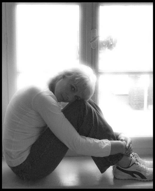
First Impression - the most important one: Not often in the comments i would say DNMC ... I did that as I felt your model was not framed by the window as well as she could have been.
Composition: The composition has her head at the very center of the picture .. for this pose this works . .but it will not always be that way .. have you looked into the tutorials on DPC .. their may be some interesting advice there.
Subject: I think your model is great ... but the challenge was "Frame the subject of your photograph using the window (as in from a building)." with her back framed by the crop and the right side of the picture without a true frame it didn't seem to do this.
Technical (Colour and light): Black and white was a good choice .. but the grain filter I think got you slaughtered in the scoring. The size of the picture is good but the quality of the picture is lacking and this is probably due to the way you took the pic with the ISO settings etc. Without that information I can't help you.
To grow its vote?: Thinking outside the box is great .. but still take into account the use of the camera and ensure that you get enough detail in the picture without blowing out the highlights too much.
Summary: Good shot .. you are doing overwell very well according to your portfolio. look forward to seeing more.
If you've got any questions about this critique, please feel free to contact me via the PM system.
First Impression - the most important one: Not often in the comments i would say DNMC ... I did that as I felt your model was not framed by the window as well as she could have been.
Composition: The composition has her head at the very center of the picture .. for this pose this works . .but it will not always be that way .. have you looked into the tutorials on DPC .. their may be some interesting advice there.
Subject: I think your model is great ... but the challenge was "Frame the subject of your photograph using the window (as in from a building)." with her back framed by the crop and the right side of the picture without a true frame it didn't seem to do this.
Technical (Colour and light): Black and white was a good choice .. but the grain filter I think got you slaughtered in the scoring. The size of the picture is good but the quality of the picture is lacking and this is probably due to the way you took the pic with the ISO settings etc. Without that information I can't help you.
To grow its vote?: Thinking outside the box is great .. but still take into account the use of the camera and ensure that you get enough detail in the picture without blowing out the highlights too much.
Summary: Good shot .. you are doing overwell very well according to your portfolio. look forward to seeing more.
If you've got any questions about this critique, please feel free to contact me via the PM system.
What can i say ,the the coments well apreciated ,yes i played with the image a bit and overdid it but hey it brought the most coments i have ever had on a challenge :) ,thanks to all
Sorry but the image quality has to be way better for you to win me over, just way way too noisy and bad artefacts. Shame as this had real potential as a thumbnail, I like the pose and the girl sure is cute.
Pretty overexposed ... it's a tough lighting situation... This would be the perfect opportunity though to expose for outside light, and use some type of a reflector to get some light back onto your subject.
sorry I just don't think it's very good, s softer use of colour such as peach/soft oranges would make it warmer and sexier, also you cropped the models toes and included a bit of the window sill (bottom right)






 Add photograph to your favorites
 Add photographer to your favorites


 Photographer found comment helpful.


