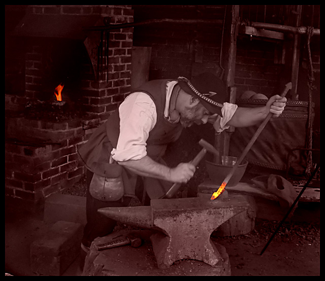
General Comments: As other commenters have stated the sepia effect here I think is well done. The effect used gives warmth to the image and reflects the period of the piece.
IMPACT When I look at an image the first 15 seconds gives me my basic opinion of the image. This is not a technical measure … but my pure emotional response from the image
This image is stunning in its contrast between the soft brown tones of the sepia treatment and the heat generated by the oranges in the flames.
PRESENTATION How the image is presented including things like bordering and brightness and how the image looks on the page.
The general look and presentation of the image is well done. The brightness and tonal range of the image is spot on. The details of the shadow and highlight regions are very good. I would have cropped a bit more to loose the object that is sticking out in the far left corner of the frame
COMPOSITION As this category implies the general composition of the image on the page
Composition is very good. The focal point to me is the glowing metal. Its placement (good use of rule of thirds) enhances the composition.
Technical I like the motion of the hammer. It adds interest and a bit of style.
The vignetting is very nicely done focusing attention to the main subject
This is a good idea. It would be a stronger photo if the figure was more toward the left side of the image so he would be facing more toward the center of the frame. It's usually good to have less space behind the main figure than in front of him. Good lighting and focus.
I would have liked to see the smith have more "brightness". Maybe a bit of a dodge in that area to just make him stand out so that the "orange" isn't the only subject. He blends too well with the bg.7





 Add photograph to your favorites
 Add photographer to your favorites


 Photographer found comment helpful.


