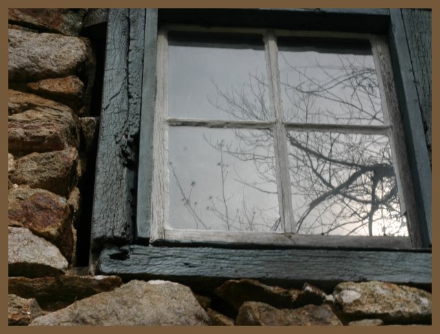
I would prefer that the window was straight vertically, and included more of the top frame, without losing any of the rock at the bottom. Focus needs to be more sharp across the whole photo. The rocks and bottom of the window frame look a little soft, whereas the rocks in the top left look sharp. Border detracts rather than enhances. Nice colors, and nice choice of subject. The reflection in the window adds interest.
Very interesting subject and well composed. Only drawback for me is the image is pretty soft. There is lot's of wonderful texture available here that would really pop with a nice crisp image.
The angle and composition gives this photo some potential. What hurts it IMO is the border and the fact it's rather soft on focus and flat on tones. A little bit of curves adjustment could make a great difference.
Wish it didn't have the brown border. I hate it when people comment on borders because it's such a personal thing, but in this case, it does draw my eye away from the picture, so I feel it's worth mentioning. Otherwise, the concept with the window is pretty good.





 Add photograph to your favorites
 Add photographer to your favorites


 Photographer found comment helpful.


