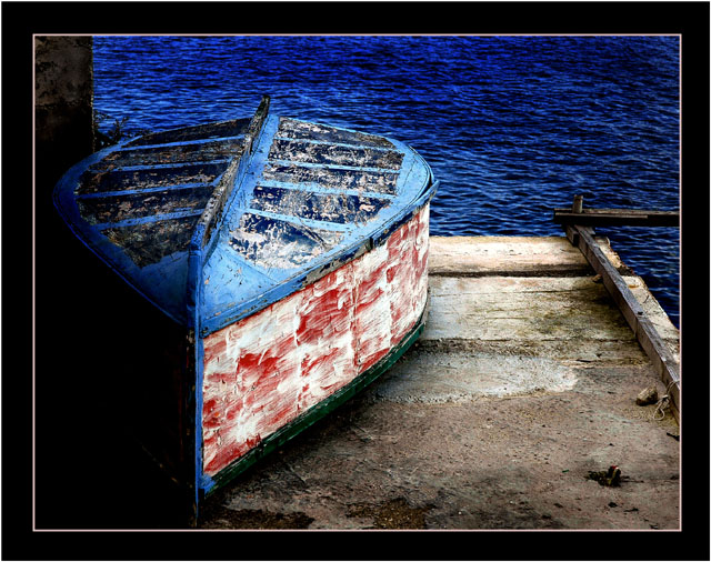
This is really very nicely seen, and it well deserves its high finish. I do have a couple of issues with the processing of it, but they don't take away from the quality of the essential work.
First and foremost, the frame seems way too heavy and restrictive for this image. Secondly, the burning-in of the water upper right is not very smoothly done, and it looks very artifical. If you did this by hand, you might want to know about how to do this kind of thing with gradient overlays. Feel free to PM me for an explanation of how, if you wish.
Finally, I wish there were a trace of separation between the boat and the wall/pier in the lower left. Not much, just a hint, to have that area come alive.
I really like this photograph. The compositon and complimentary colors make this visually appealing. I am not sure if it my monitor or not but it looks oversaturated. The water looked like velvet. Despit that I still think it is a much better than average shot. 7







 Add photograph to your favorites
 Add photographer to your favorites


 Photographer found comment helpful.


