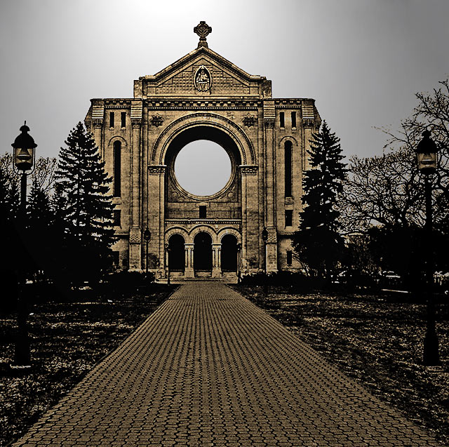
This would work better if the building were more centered. The building isn't tilted, but I think the off-centeredness of it makes it look like it's leaning to the right. It's a weird optical illusion.
wow, i love this, the pathway draws you into it, the only thing is the circle in the middle, i can't take my eye off it, it distracts you from the rest of the photo, its a 9 from me
I love the DOF that you created using hyperfocal distance. It colors are a little weird on my computer but then again I have not calibrated my monitor this month.
I'm a big fan of these sharpened type images. It really brings out the detail in the intricate work on buildings and walkways, especially in this image. Very beautiful. A 9 for me!
Wonderful leading lines and what a gorgeous building! There seems to be a lot of post-processing here - I can't decide if I like that or not, hmmm. I guess I would prefer a bit less post-processing. Otherwise though, I like this image very much for the reasons stated above. Good luck with the challenge!
I like the artful approach. The first thing that jumps out to me is the tilt. It is blatantly tilted to the right and that really hurts it for me. I love the rich tones of black and golden brown. Nice detailing on the brick path and the church itself. The blackened trees work as well.






 Add photograph to your favorites
 Add photographer to your favorites


 Photographer found comment helpful.


