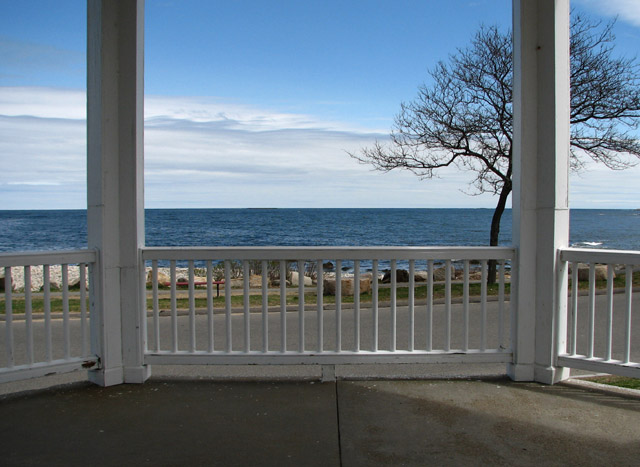
Pretty view. Maybe the composition could be a little better if the horizon wasn't as much in the center? I get the feeling that the scene has been too evenly divided... But maybe this was the effect you were aiming for? I realize that you can't move the tree :) But I find myself wanting it to move more toward the center.
The light and shadow in the foreground don't appear to have been thought about. Obscuring part of the tree seems accidental. Symmetry can make a photo look like a snapshot if carried out unimaginatively by a beginner.
why didn't you crop the photo so you could only see the actual window? the fence and the foreground doesn't really add something to the photo IMO, and without it I think it would be a bit more interesting, also if you make the colors a bit more sparkling
Wonderful blue and cold colours here! I like the branches of the tree. The composition is nice but maybe could improve cropping the dark area down of the shot. Anyway, very nice.
Great view. That latitude with the challenge theme will certainly result in a certain amount of low scores. I also would have liked the opening to really frame the image more. Crop in and catch the top of the porch to close off the frame. You should definitely revisit the tree as a subject if possible, perhaps from a similar vantage point.





 Add photograph to your favorites
 Add photographer to your favorites


 Photographer found comment helpful.