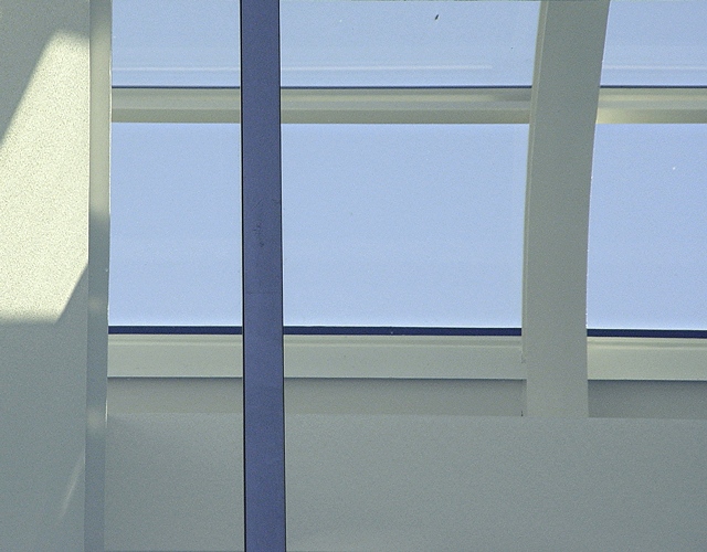
I'm giving you credit for the two spots that under other circumstances would have been cloned out...great colors and very nice expression of the competition.
With all the horizonatal and veritical lines it reminds me of that artist that did those geometric paintings. Kinda like the L'oreal logo. Don't remember his name. I like this picture. Only thing that I don't like is the reflection on the left column. The shadows are otherwise very nice.
Meets challenge pretty well. The different colored beam really stands out. The dirt spot on the window is distracting as is the big white spot to the right. If those were gone it would improve the shot a lot I think.







 Add photograph to your favorites
 Add photographer to your favorites


 Photographer found comment helpful.


