In my opinion you did not deserve the brown ribbon.
All sort of comments that you are receiving about wrong colours.
For me I have also received such a comments probably because I am colourblind and I always have to get help with the colours if I make changes in them.
Better luck next time.
Edited: I see in your profile that I (the egg) was trying to teach you (the hen) :-)
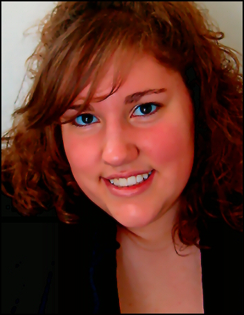
She's very pretty but either your lighting or post processing has gone wrong. The whites of her eyes are blue and her skin is way too red. You've also used too much neat image, giving her skin an artificial, plastic look. Sometimes natural is better.
The color on this one is way off. The whites of the eyes are really blue on my monitor. Also the skin is orange. I think you need to work more on your post processing to make colors more natural.
Nice composition, but the post processing needs some work. The whites of her eyes look blue and her skin has way too much magenta. Good DOF and sharpness though! Overall a very nice picture - just a little over processed (IMO).
Strange how the eyes are sooo blue and the teeth still white. I cannot even find a quick fix in Photoshop. :( Skin tones are too red and the overal feeling is that this has been neatimaged to much.
Too much saturation, The hue is off from said saturation, her skin is plastic and too much contrast leaves a lot of detail to be desired. When working with saturation remember to compensate the hue to keep an natural skin tone.
I'm sure someone has already mentioned this but in case not those whites look blue. I guess that was on purpose but I don't see how that enhances the shot.
this could be a nice shot, but the neat imaging is a bit OTT. the blue eyes? maybe a little scary. the colours are good, and like the rich, flat black.
I am trying to comment on any picture I vote 4 or less. I am not professional photog by any means, but trying to justify my scoring with the hope that it helps.
Small size? Face looks red and eyes are too blue. May be it's just me but it looks to me to much photosop.
Your colors are off, which may have been intended but it doesn't work for me. Her skintones look too red and the whites of her eyes are blue (yet her teeth are white). Other than that, it is a nice, flattering portrait and the composition is good. A smaller nitpick, having her neckline incomplete (cut off by the crop) leads my eye out of the frame. A 5 from me.
two words "White Balance" this is just so wrong unless I am missing something about your stlyr but did you really want her eyes so blue and her skin so red? Not something I could see someone ordering from a photographer to frame. Or maybe it's just me. Sorry lowest score I have given so far.
I gotta say that you must have screwed up in setting the WB correctly or you really screwed up in the post processing. I can´t imagine her having such a red face in person and what is up with those whites of the eye? They are blue? Shame as the girl seems very lovely, I don´t think this photo does her justice.
3 tips for you to improve your score. 1. Make sure you set the WB correctly if you are shooting .jpg, it´s very hard to adjust later. 2. Make the most use of 640px max dimension. 3. If you are not sure what to do with the photo in photoshop, don´t do anything but basic adjustments to colour, contrast, cropping and sharpening, too much post processing is the easiest way to ruin a perfectly good photo...
Too much Neat Image (her hair, eyes, and lips have a weird unnatural texture), and not enough light on the subject, though it is pretty even (which is good).
There appear to be some serious color issues on this. (I say 'appear to be' since it may have been intentional - if it was intentional, I don't think it 'worked'.) Her skin color is way off. Even if she was sunburned, the color is still off. Also, the whites of her eyes are blue. I find this odd since the background is gray shading to white, which leads me to wonder if the eye color wasn't a result of trying to compensate for tooth color or for overdone redness in the skin or for bloodshot eyes...
At any rate, in the future, one of the best ways I have found to correct skin tone without throwing off the color of the skin (ie, adding too much red), is to copy your background layer and convert the copied layer to black and white (I usually use 'desaturate'). You can then adjust the opacity of the b&w layer using the slider until you get a more normal looking skin tone. This helps to correct skin that is too red or too yellow, and I've found that it also helps to correct bloodshot eyes and yellowish teeth without going overboard.
I'd also recommend (if the colors were not done deliberately) that you either have your monitor calibrated or if you work on a flat screen monitor to check your editing on a CRT monitor as flat screens can sometimes distort colors and contrast.
There are some good points to the photo. Her smile is wonderful, the pose is natural, the lighting seems good, and the focus is good. Just need to work on the color.







 Add photograph to your favorites
 Add photographer to your favorites

 Photographer found comment helpful.


