| Author | Thread |
|
|
05/10/2006 08:16:43 PM |
Comment from a member of your own commenting club :-)
First impression
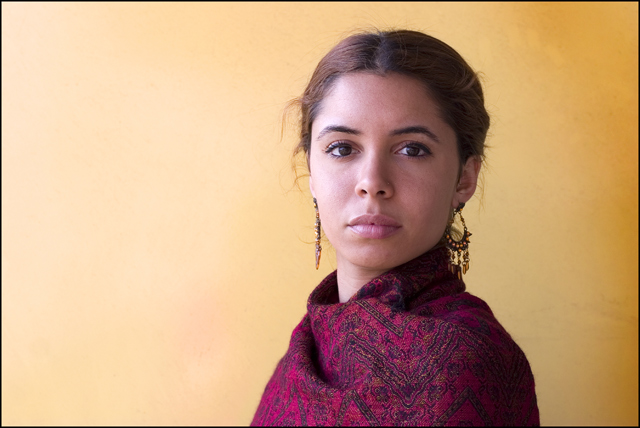
1. Beautiful model and you captured it well
2. Good use of colours and lighting
3. Don't know what R*E*T*I*C*E*N*T means and therefore have to look it up. Finding out that it can be many things so it takes away thinking of the picture. There are so many "Non US" on DPC like me and only understand simple English.
4. Good border pick.
What could you do better
1. This is a good example of perfect rule of thirds, i.e. eyes are in the top third, person in the right third but in my opinion you should have zoomed a bit more in on the girl or add something to the picture. There is to much of empty space.
2. There is nothing else that I know of!
Hope this helps
Message edited by author 2006-05-10 20:30:36. |
|
 Photographer found comment helpful. Photographer found comment helpful. |
|
|
05/07/2006 11:31:36 PM |
Greetings from your own critique club.
First Impression
Very Nice POrtrait shot.
Composition:
Not sure about the cropping. I actually saved this picture and tried crop myself. I definately think the cropped one is looking better.
Subject:
I really like the subject. Nice expressions.
Technical (Colour and light):
The color and lighting is perfect.
Improvement:
Tighter crop.
Summary:
Nice picture over all. Tight crop of it should have scored higher.
Best of luck for your future challenges. |
|
| Photographer found comment helpful. |
Comments Made During the Challenge  |
|
|
04/23/2006 10:57:03 PM |
very striking.
a little contrast would help it in tone and definition other than that its very striking and well done. nice DoF also |
|
| Photographer found comment helpful. |
|
|
04/21/2006 06:34:24 PM |
|
I like the way the colors work here and to some extent the position of the girl in the frame. I'd like to see more of her body turned towards the camera to create depth. |
|
| Photographer found comment helpful. |
|
|
04/20/2006 10:45:23 PM |
|
Whoa! The colors are clashing for me. The first thing I saw was the clash in the color, the second was the intensity in her look. I'm almost positive you may have wanted it the other way around. |
|
|
|
04/20/2006 09:53:54 PM |
Nice expression, somewhat odd placement IMO, may be moved furhter to the right ?
if I have to guess the photographer, then possibly rooster |
|
| Photographer found comment helpful. |
|
|
04/19/2006 09:03:40 AM |
|
So Gorgeous... captivating! 10 |
|
| Photographer found comment helpful. |
|
|
04/19/2006 04:27:39 AM |
That is a pretty face. The lighting is good.
I'd like to comment that while this worked, I personally would prefer a tighter crop around her face - bringing out more facial details. good work. |
|
| Photographer found comment helpful. |
|
|
04/18/2006 08:02:32 PM |
|
that's a beautiful photo. great work. |
|
| Photographer found comment helpful. |
|
|
04/18/2006 03:10:29 PM |
|
i like this the colros and composition. but something is missing. i cant quite put my finger on it... maybe sharpness, a very slight slight sharpness is missing? |
|
|
|
04/17/2006 09:38:29 PM |
|
Pretty gal but seems a bit plain and background on the right doesn't seem quite right in coloring |
|
|
|
04/17/2006 09:08:40 PM |
|
Fantastic lips on this model Gorgeous! 10 |
|
| Photographer found comment helpful. |
|
|
04/17/2006 06:25:51 PM |
|
A very beautiful model! I like the choice of background color as well. The lighting seems perhaps a bit flat to me, but you've captured some very nice detail in the face--especially the eyes. |
|
| Photographer found comment helpful. |
|
|
04/17/2006 12:15:20 PM |
|
Wonderful! Great composition, and I love the yellow background and red shirt. (added as a favorite!) |
|
| Photographer found comment helpful. |
|
|
04/17/2006 08:52:26 AM |
|
| Photographer found comment helpful. |
Theme:
Classic /
Light /
Dark
Home -
Challenges -
Community -
League -
Photos -
Cameras -
Lenses -
Learn -
Help -
Terms of Use -
Privacy -
Top ^
DPChallenge, and website content and design, Copyright © 2001-2026 Challenging Technologies, LLC.
All digital photo copyrights belong to the photographers and may not be used without permission.
Current Server Time: 10/17/2026 04:19:46 PM EDT.






 Add photograph to your favorites
 Add photographer to your favorites


