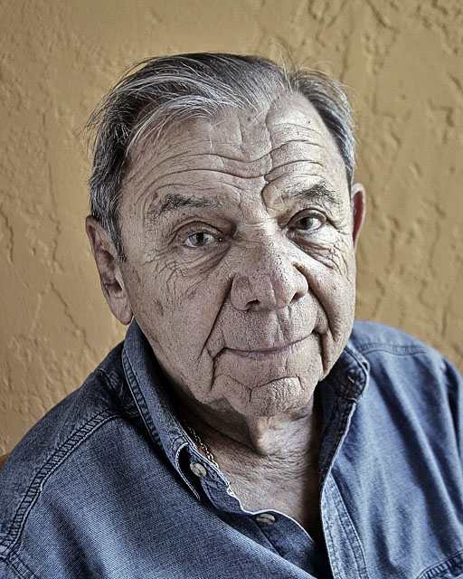
too much detail on the skin. Especially the nose and mouth. Unsharp mask in separate channels could give you a sharper image without enchancing grain and skin defects.
I find the background to be too distracting color-wise, due to his face appearing slightly desaturated. Otherwise, great lighting, composoure, and focus.
Wow, this picture really didn't look all that impressive as a thumbnail, but — "actual size" — it's awesome. This is one of the bext portraits I've seen recently.
Either black and white a toned image would have been better or just the original colors. Nice character and portrait. It never hurts to try different things for other probably like it. The main thing is you have to like it.





 Add photograph to your favorites
 Add photographer to your favorites


 Photographer found comment helpful.


