Hello, and greetings from the Critique Club. What follows is my best attempt to Critique this photo from a DPC voter's point of view. I'll do my best, but please excuse any comments that may be unintentionally rude or insulting.
Initial Thoughts
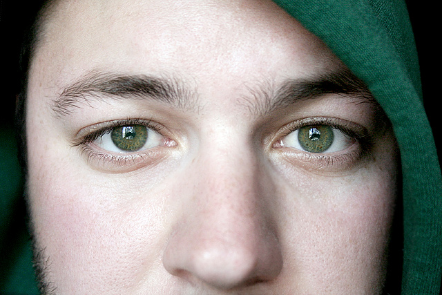
A little too close in. For studio portraits, I expect people are looking to see more studio, and less "person", if you know what I mean
Composition/Content
Nice composition, although suffers from being neither close enough in, or far enough out, IMO. The head covering is a neat idea, but for some reason doesn't really add anything in this instance. Eyes are great, but lack that extra something.
Background
N/A
Camera Work/Technical
Decent camera work, but your lighting is a little too flat. Not enough shadows, texture, or dynamics there to really set anything apart or bring it out.
Digital Processing
Some good work, but I think more attention payed to bringing out the eyes, and darkening the areas around them might have pushed your score up. Voters love that "dragan" look, and getting a shot like this closer to that look would have helped dramatically.
Fits the Challenge
Iffy on this one. As I said, I think voters were expecting to see more of a studio environment as well as the model, so you might have been hit for that. So it fits the challenge *technically*, but misses the mark because of the lack of showing the environment.
My Opinion of the Photo
A nicely done close-up that just lacks the punch to make me really care about the photo.
I like this, and I love that you don't have a title, I rarely look at them because I think the images should speak for them selves and tie into a challenge theme on its own merrits, and your does.
Nice. I just feel this would have been better with little warmer tones. Reflection in eyes is little distracting (just a little). Still different from others and pleasing photo.8.
Looks more like a candid than a portrait.
Most portraits include eyes only or the whole face.
leaving the nose in is a little unorthodox and confusing I might add
Very sharp and clear, I wonder how much more impact you'd have gotten with some darkening and contrast adjustment. There's so much good light there to work with, it's maybe just a little too much aat present






 Add photograph to your favorites
 Add photographer to your favorites


 Photographer found comment helpful.


