That's a sweet shot, Kashi! :) You should find an appropriate challenge and reshoot using the advice you got about composition, noise, and the blown highlights. You'd break 6 for sure!
I had to add this to my "favorites", I love the lighting and his "contemplative" gaze. I do have to ask, how many shots did you have to take to get this perfect look?
Hi, as requested, here is an indepth critique of your submission.
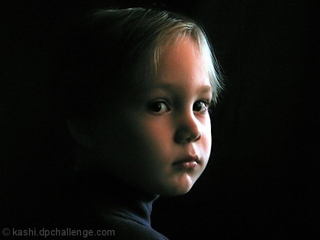
First Impression - the most important one: Nice low-light portrait. You have a bit of noise (due to low light with a P&S) but overall a good quality portait.
Composition: Composition is a bit irrelevant to discuss in portraits. As I see it, it either works or it does. Yours does, but I think it'd be a bit stronger if you had moved your subject to the left side of the frame.
Subject: Clear, in-focus and well isolated from the background. And your lighting has wonderfully isolated the face.
Technical (Color, focus, and light): Color: color is going a bit green in the shadows. I suspect that is due to the response curve of your camera in low light.
Focus is sharp.
Light: love it! Worked well for you. Only issue I have is the blown highlights in the hair at the right side of the image.
To grow its vote?: Not actually sure. A bit stronger composition probably would have gotten you over the 6 mark as would the blown highlight area. But overall, there was some tough competition in the upper-ranks with a lot of expensive equipment.
Summary: Well done portrait. Definitely a keeper.
To answer your question about banding: It is usually an artifact of having a large gradiant of colors. Banding is when the gradient does move smoothly from one shade to another and starts to visually seperate. I can't agree with crayon, I don't see it happening in your image. I think what he is seeing is difference in lighting that he assumes is banding. I say that because I don't see any distinct lines between shades of colors.
To see what I'm talking about try putting a posterization adjustment layer over the image and notice how the colors start to seperate.
Hope that helps and hope to see more from you soon,
Leroy
seems to be some banding (whatever they call it) on the child's face.
Could have been removed with softening. But if grain is what you are after, there isn't enough in the photo to make it obvious - the one on this photo looks more accidental than purpose. cheers. 8
Great image, nice lighting. The grainess gives it a canvas like feel, although that may actually be hurting you in the voting (as DPC'ers hate noise). Nice capture.
seems to be some banding (whatever they call it) on the child's face.
Could have been removed with softening. But if grain is what you are after, there isn't enough in the photo to make it obvious - the one on this photo looks more accidental than purpose. cheers. 8
I love the dramatic lighting. It creates a perfect mood for his expression. Well done getting a catchlight into his left eye. I think the highlights are too hot, though. 7 from me.
Nice image with lovely soft lighting, but the noise in the photo really detracts for me. I also think strong focus or selective sharpening on the eyes would have been great, and a portrait orientation of the image overall would have been most effective.






 Add photograph to your favorites
 Add photographer to your favorites

 Photographer found comment helpful.


