Woodward park Tulsa Oklahoma
Adjust exposure in raw, brigt and contrast bump.
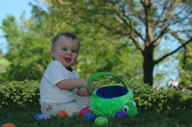
My son is my most willing model, will more than likely be bashed for using a child.
No cropping but shot nicly follows rule of thirds
Statistics
Place: 193 out of 199 Avg (all users): 4.2192 Avg (commenters): 3.8571 Avg (participants): 4.1273 Avg (non-participants): 4.2867 Views since voting: 1127 Views during voting: 392 Votes: 260 Comments: 23 Favorites: 0
Hello, and greetings from the Critique Club. What follows is my best attempt to Critique this photo from a DPC voter's point of view. I'll do my best, but please excuse any comments that may be unintentionally rude or insulting.
Initial Thoughts
Looks like an outdoors shot made to look like a studio.. a little dark.
Composition/Content
This is ok compositionally, although it could be stronger with a tighter shot on the child and less space around him. This would also help with the "illusion" that this was taken in a studio. Content wise, you've got a great model. Lively expression, and nice, if classic/cliche, posing.
Background
As I've mentioned, the background looks as if you've intentionally tried to make it look like a backdrop instead of the outdoors. Which, is a fine idea, but the wide crop sort of ruins that illusion. Also, the background is too bright compared to your model, which also ruins the illusion to an extent.
Camera Work/Technical
No real problems with your camera work. You've done a nice job with the DOF and sharpness on your model. Lighting is where the problem falls. You needed to get more light on your model. Whether with a fill flash or reflectors, it was imperative that he be better lit. He's far too much in the shadows, and as such, the background takes over.
Digital Processing
On the issue of your model, if you have Photoshop, you might try using the shadows/highlight tool to bring out your model. Done right, I think it could really help in this instance. You processing looks good, but again.. the foreground is simply too dark.
Fits the Challenge
This is where it gets complicated. As cropped, I think that you may have gotten hit by too many "this isn't in a studio" votes, even though you've done a nice job with the illusion. Cropped tighter, and with more lighting on your model, I think you'd have pulled off the illusion much nicer and made more people go in favor of it being "studio" and not "outdoors".
So, it kind of fits the challenge, but not really.
My Opinion of the Photo
Very cute, but the darkness of the foreground throws me off. I'd have really loved it with better lighting.
Open shade with a bright background, you'd do better using a hand held spot meter than relying on your camera meter. To dark... Lighten the whole image a bit and use curves to brighten up the mid-ranges.
What a sweet expression, he seems a little underexposed though to me. The background is very nice, can't tell if it's a set up or if it was shot outside. Either way, very nice.
Very cute capture. All nicely done except that the photo looks underexposed , lacking contrast. The color balance looks a bit off. In this case those things can be fixed in post processing. This is a keeper. Still bumping it up but cant give it a high enough score I would've liked to.
a nice shot, but the lighting is poor and detracts from the effect. the trees in the background distract from the boy, as they have a lovely lihgt on them. if he were lighter, and the basket less shiny, it would be much better. he looks like he had a great time!
nice use of DOF to isolate the child from the background. I like outdoor shots like this one. My only complaint on this photo is that the child needs to be brighter?
You did read the challenge name didn´t you? It´s color STUDIO portrait II so this doesn´t meet the challenge obviously. Anyway, besides that this is a potentially promising photo but if I ever saw a photo that needed some fill lighting, this would be it. Turn on your flash next time and I promise you you´ll love the results. Also the red object in the left corner is distracting, clone that out or crop the photo and it would improve heaps. Sorry but I gave this a 2, 90% because of DNMC and 10% because of the fill lighting/red object in the corner. On the plus side I like the shallow DOF and that sure is a cute model that I´ll bet is willing to pose for a reshoot of this :)
Nice job finding a good natural setting. The background works well. He is underexposed and your white balance is off. The shade is making his skin tone too cool. A cutie!
Check your white balance - and then adjust the contrast using a curves adjustment to make it "pop". The kid should be the star of the image, instead he feels "flat" - the curves adjustment would fix that.






 Add photograph to your favorites
 Add photographer to your favorites


 Photographer found comment helpful.


