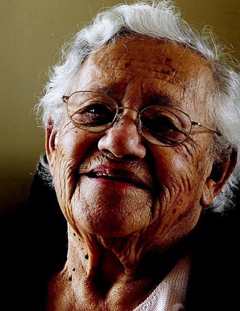
This is my nana I did a huge photo shoot with her .. I love her .. I love her age and her wrinkles and because of those I respect her hugely. This picture is to show her more serious side ... taking into account the 14 kids and the huge number of grandkids and 58 great grandkids and 10 great greats ... she has lived well.
I range her and said I gotta take your photo ... she asked why .. I said you are going to be my entry into something old ... she laughed ... I hope I captured some of that laughter.
Post challenge ...
Lots of people mentioned that this is over sharpened .. so I thought that letting people know that the only sharpen used was once the picture was reduced. Those wrinkles are real!
Interesting
Statistics
Place: 71 out of 402 Avg (all users): 5.7656 Avg (commenters): 6.1000 Avg (participants): 5.3714 Avg (non-participants): 6.1635 Views since voting: 793 Views during voting: 270 Votes: 209 Comments: 14 Favorites: 0
A very fitting entry for this challenge, I think. She is a very engaging character, and I think you have captured that character well. I like how you've really displayed the texture, and showcased all the wonderful years that this visage has experienced. A classic portrait head shot composition, and obviously works fine for this photo. Nice job with the background too.
I think the main thing I'd like to discuss here is the lighting of the shot. It's not bad, I think it seems purposeful and thought out, and is heading towards a goal, but a couple of things strike me about it. First of all, I like the sidelighting thing, going back to the texture, and I really like how it lights up the hair, adds a lot to the appeal of the character of Nana :-) However, it seems on the verge of being too harsh on the left. Not too bad, but I think what it does is really emphasize the dark areas in a slightly negative way, especially around the eyes. What I'm wondering is perhaps getting some reflected light from the bottom right area could lighten up the eyes and dark areas a touch, just enough to get back some of the detail there. This could even be as simple as having Nana hold white poster board or something out of the frame. Something to think on anyways maybe. A couple of commenters mentioned the tone, or slight hue. I can see that, but it is a minor thing I think. As graphicfunk pointed out, perhaps a slight drop in saturation could make a difference. Even just a little slight tweaking in levels, or selective color maybe?
Overall, a very nice, touching portrait. I think you've done a fine job of catching Nana's essence, and conveying your love and respect in the shot. I think this is a set of photos that years down the road, you will cherish and revisit many times :-)
If you have any questions or comments or anything, please feel free to contact me.
wait...huh? are the two same pictures here? I though i already left a comment on this one....the lighting seems different...
Ok, no i was wrong. Damn, with all of this studying for exams i must be loosing it.
To the point: i thought i recall leaving a message saying the following:
Great texture but the lighting in the top left is a little to harsh and makes the eyes very dark. it would have been nice to see more of her eyes. good work though
The next day: ok, nooow i get it. There is a similar picture of this women on the portrait challenge, that's why I got all confused.
This is almost a great photograph, but the lack of a highlight in her left eye is really bothersome. You did a great job of capturing the texture of her skin and hair, though.
She looks like a lovable, kind, and intelligent woman. I love the sharp focus you have and that glint in her eye, but I wish the light was slightly different, to eliminate some of the shiny spots on her skin. The light in her hair, however, is perfect.






 Add photograph to your favorites
 Add photographer to your favorites

 Photographer found comment helpful.


