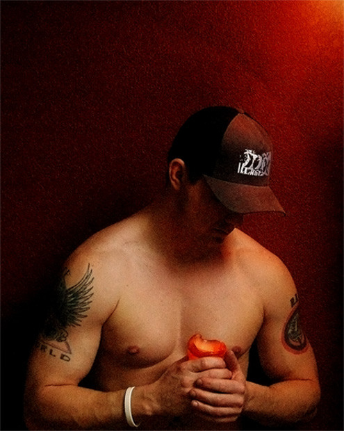
Adjusted Brightness, Image Size, Color Balance, Cropped & Sharpened and that is all. This is a pic of me in my living room acting like the noble one. Last second submission so I hope you like.
Statistics
Place: 149 out of 199 Avg (all users): 5.1467 Avg (commenters): 6.0769 Avg (participants): 4.9252 Avg (non-participants): 5.3026 Views since voting: 1755 Views during voting: 450 Votes: 259 Comments: 16 Favorites: 0
i can't believe you got dogged for the photo being grainy. i don't see it as a distraction at all, but it rather enhanced the mood of the image. great shot and don't listen to the detractors!
Hello, and greetings from the Critique Club. What follows is my best attempt to Critique this photo from a DPC voter's point of view. I'll do my best, but please excuse any comments that may be unintentionally rude or insulting.
Initial Thoughts
Dang.. nice body, and I love the look here
Composition/Content
I'm a little wary about the amount at the top here. Not sure that it's something voters liked, but can't really know. No comments to that regard anyway, but it seems just a little "off" to me. Your model is great, and it's a very emotive pose.
Background
Great coloring, really plays off with the model
Camera Work/Technical
Everything seems pretty good here for the feel of the photo, but without that sharpness that voters expect, you lose a few points there. It's unfortunate, but sometimes we have to take that hit to be brave with our vision.
Digital Processing
The Grain. Oh, the grain. The voters, obviously, really hit you hard because of this. On DPC.. grain is, usually, death. I know that you probably knew this and went against the grain (pun intended), and this isn't a knock on you.. but for DPC submissions, if you care about scoring, avoid it! For me, it's what *makes* the photo. It's perfect, and the darkness and mood are really cemented by it.
Fits the Challenge
No problems here. Fits to a tee.
My Opinion of the Photo
Possibly one of the better color portraits I've seen that isn't the "DPC Flavor of the Month". Congratulations on being brave enough to submit something different. I love it, and although I'm a little off on the amount of upper negative space.. it's a job well done.
Cool shot, grains works well. It seems to tell something about the character of the one being portrayed. Nice subtle light. The red background works well with the hat and skin colors.
I normally hate portraits where you can´t see the face properly but in rare occurances it works and it certainly does that here. Like the shot, I feel like it says something about the character in the photo. 7 from me.





 Add photograph to your favorites
 Add photographer to your favorites


 Photographer found comment helpful.


