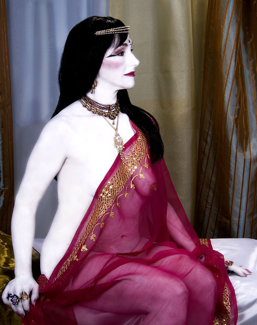
This is an image created as part of a self-directed project; entitled: "Porcelain Dolls".
For those commentors who asked, here are the steps taken to create my entry:
Photograph was taken in my home-studio, in St. Charles, MO: after a very talented make-up artist applied white body paint, body jewels and facial make-up.
The photograph was taken with a camera raw file format setting.
Using Photoshop CS2, I opened the file and, within the Camera Raw dialogue box, made the following adjustments: temperture @ 5500 (flash), tint @ 0, exposure @ 0.00, shadows @ 0, brightness @ 15, contrast @ +15 and saturation @ 0.
I then saved the file as a TIFF formatted "work" file.
Upon opening the TIFF formatted "work" file, I then:
1. cropped the image
2. made a layer which was a duplicate copy of the background layer
3. created a blank layer (normal mode) and ... on that layer ... used the clone and healing tools to clean-up the photograph (e.g., stray hairs and blemishes/wrinkles); plus used paint brush (at varing degrees of opacity) to even out the model's body paint
4. created another blank layer (normal mode) and, using that layer, "merged visable"
5. settings of 96%, 3.6 pixels & 5 levels
6. curves adjustment layer, without mask, to set black and white points
7. levels adjustment levels, without mask, to adjust contrast
8. created another layer (overlay mode with 50% gray) and, on that layer, used paint brush (at 10% opacity) to dodge (white) and burn (black)
9. saved file.
I resaved the file as a TIFF formatted "print" file. Upon re-opening the TIFF formatted "print" file, I, then:
1. flattened layers
2. changed file to 8 bit (from 16 bit)
3. settings of: grain @ 0, glow amount @ 1 and clear amount @ 12
4. using the history brush (at varing degrees of opacity) to reduce effect of distort filter on the model's white body paint.
5. saved file
I re-opened the TIFF formatted "print" file and I, then:
1. re-sized image to a height of 640 pixels at a resolution of 150dpi.
2. saved as a JPEG file
this was the file that I submitted as my challenge entry.
Statistics
Place: 121 out of 199 Avg (all users): 5.3925 Avg (commenters): 7.3333 Avg (participants): 5.1081 Avg (non-participants): 5.5974 Views since voting: 1806 Views during voting: 775 Votes: 265 Comments: 27 Favorites: 0
Hi! When I first saw this image during the challenge I thought it was a really big doll, so you succeeded in that concept. I see this is your first entry here to DPC, welcome!
I also thought to myself, it has a lot of color! It was a very interesting project and picture to look at but I had the many of the same concerns that were mentioned below for this to be considered the "classic" color portrait. The ultra white skin, the idea that it's more about you instead of the subject themselves.
But in itself it's lovely, classic in a painting sort of way and the model is beautiful. The composition is very nice, the lighting is well done and the colors are excellent. You did a wonderful job with this overall and if another type of challenge you probably would have scored a little higher.
Hope my comments help and good luck in future challenges!
Bizarre. I dont know if I want to hang it on my wall or even stare at it for long, still I rate it high on being different and bold. Beautiful post-processing. I would like to know how you did it. Very artistic. 10.
Nice piece of artwork, with the colour and composition. Technically impressive. Looks a bit more like a study than a portrait though, by which I mean that it's more about the artist than about the model. I think it would be improved by losing/blurring anatomical detail under the veil, or it may be that you've lost too much in the whiting out of the exposed flesh.
Still impressed by the colour and the graphic strength.
The concept of this one is really great. I love the contrast of the pink against the background. For me, though, I did not care for the really overwhite exposure of the skin. I assume you were trying to make it marble like. Even so it is very creative and unique in its approach. 7
Interesting and unique image. I like the colors, composition, contrast and the focus is good. The white may be too extreme for many but it makes the image stand out. Also, it seems her arm is a bit soft along the edges where as the other parts of her like her face and shoulder is more sharp. Not sure if that was because of some post editing work or not but I'd try and get that all fairly sharp to be consistent and also because the areas where it is sharp helps produce good contrast.
Strange, she is so blue-white. Some what creepy, but I like creepy. At least this is creative a lot more art and intent put in to this work. Well you made me stop and think, so good for you. 8 for that alone.
I am not sure what I am looking at. If this is a painting, than you are out! If this is a person looking like a painting. You have done to good job, because than nobody can tell the diffrence.






 Add photograph to your favorites
 Add photographer to your favorites


