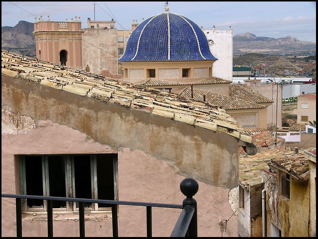
What a lovely old building and area of town! Looks like there would be a lot of history in this picture!
I see a couple of things in this shot that bother me though, first the overall composition is wanting, you have lines leading me all over the place but nothing is really keeping my attention, giving me something to focus in on. The rail in the front is very distracting and the different levels of the roofs is also very distracting. They are all fighting each other for my attention. THen you the blue dome in the middle pops up at me and yells, "HEY! OVER HERE!" Mayve if you had focused mostly on the blue dome and the spire on top of it, zoomed in over there. Then you would have a focus to your shot, someplace for people to concentrate on. Use the roof in the very front to lead me to the dome, cutting out the rail completely. Just my thoughts.
Also the lighting seems at high noon, very bright and over powering. Maybe a levels/curves or brightness/contrast adjustment could soften it up just a bit. Bring out the colors more. If you also used the Hue/saturation to diffuse the other colors and bring out the dome, again, giving the picture some focus.
Hope my comments help and good luck in future challenges!
I'm torn on this one. The blue roof is really cool, but the rest of the picture is blah for color. When that occurs, I recommend B&W and go with textures and shapes. I pulled this into PS and tried a B&W treatment. The blue channel gave it some nice moodiness and then I really upped the contrast and lowered the brightness (+30/-30). It, to me, gives it more of an actual old feel. However, then I don't get to see that cool blue roof, so I don't know. The other criticism is the roof is very centered. Cropping or composition should have thrown that subject to one side or the other.
The technicals are well done except you shot at midday and that always leads to a less interesting picture. The same at sunrise or sunset would likely have been better.
Very flat light has robbed this of a possible sense of magic, of real age i think. The composition is quite clumsy too - the blue tower/minaret is the obvious draw in this image, and your placement of it in frame doesn't do anything to aid the movement of the eye through the frame; a corner, a thirds line, at a point of joining of the various lines implied by the roofs ... but here the window and the distance have an equal draw and make the whole rather difficult to enjoy.
Composition seems to have distacting elements with the railing in the front pulling away from the real subject of the photo. In my opinion, lines would be nice if it were cropped, leaving out the rail in the forground. Nice colors





 Add photograph to your favorites
 Add photographer to your favorites

 Photographer found comment helpful.


