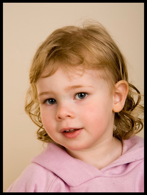
home studio, 500w bowens with 24"x24" softbox on background, 500w Bowens with 55"x39" softbox on the right, 500w Bowens with white umbrella on the left.
crop, NoiseNinja, small cloning to remove scratches in face, resize,border, smartsharpen, save, upload.
my daughter is the model, this is shot 39 of 50 I shot of her.
Statistics
Place: 119 out of 199 Avg (all users): 5.4296 Avg (commenters): 7.1111 Avg (participants): 5.2281 Avg (non-participants): 5.5769 Views since voting: 915 Views during voting: 368 Votes: 270 Comments: 18 Favorites: 0
Sorry for getting to you late. Overall I thought this was average. I think a slightly wider crop on the right would have been nice. Her eyes seem a bit soft - its nice when they stand out. Selective saturation on her pupils could have helped bring them out some more. She has a nice expression and her skin tones are very nice. I guess overall the shot is a bit too soft for my liking. The background color seems to be a bit off as well - or just an odd color. The fact that you submitted a pic of your kid had nothing to do with my voting score - I seem to do it alot even though the DPC crowd tends not to vote those shots too high.
The first thing I notice here is the two catchlights. This has started to be something I really look for in portraits since I heard that a single catchlight in each eye is most desireable. I gave this photo a 5, partly because there is some kind of color cast - possible magenta? - that I see first thing. Beautiful girl :)
Sorry, this is gonna be a stream of random thoughts rather than anything proper. Struggling to catch up last entries before rollover. Will be better next week :)
Its a pretty portrait, nice relaxed expression/pose. Part of me doesn't like the fact that theres very little contrast between the colours of skin, b/g and jumper, but maybe that aint so bad, just could tweak the white point so the b/g's whiter
I'd like to see slightly more sharpness/dodge/burn on the eyes to bring them out slightly
I think this is a great portrait with good lighting, which I think could have been slightly improved by having the right side of her face in slightly more shadow. A slightly tighter crop, closer to her head, would have done it for me too. Great colour, lovely tones that match in hair/background/clothes, nice sharpness, terrific catchlight in her eyes. Well done. :)
First of all, it's not fair to use such a cute model. She steals the scene. My first 'photographic' thoughts are that her skin tones are wonderful and her hair color is highlighted well. However, her eyes are not as striking as her skin and hair. Maybe it's the clothes she is wearing or the color of the background. Her eyes are certainly pretty. I think another color for clothes or background might bring out the color of her eyes. Over all, the focus is good and the picture has a wonderful soft tone that complements your model.
The lighting and expression are very good here! What I'd change if I could are the colors of her shirt and/or the background to get a bit more overall color into the picture, and to provide a bit more contrast. She needs just a bit more room on the right of the picture, to get all of that lovely curly hair in the shot. Gorgeous model, by the way! Tell her she did a good job!
I thought this was very well done, I voted this an 8 during the challenge. I personally like the soft focus with kids (as you can see whenever I enter one). You generally tend to get banged for that here. But this is an adorable picture that you can treasure and that counts more than a score here.
Great pose and terrific catch lights in this one. I think that a change of wardrobe would have enhanced this one a ton. Her shirt doesn't really stand out from the background. I'd also open up that aperature a bit to lose some of that bg info overall.
She is stunning, such a sweetheart! Beautiful pose, too. The only thing I don't like is the color cast/white balance, it doesn't look quite right. Or perhaps it is the combination of pink top and the background..... not sure.







 Add photograph to your favorites
 Add photographer to your favorites

 Photographer found comment helpful.


