while not focusing on the challenge but just the image I find numerous things wrong that can easily be fixed.
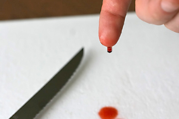
since the white background doesn't fill the frame than the brown stripe at the top should be a bit bigger to fill 1/3 of the image, and it needs to be horizontal.
the knife points to much towards the center of the image, make it rise a bit more and place it on 1/3 vertical line.
the finger is perfectly positioned, at the 2/3 vertical and 1/3 horizontal intersection, well thought of.
the blood looks to fake, blood is not clear, it's almost brown, thick and sticky. try molasses and red food dye, works in the movies ;)
and since you are showing blood but no cut I wonder how you cut the top of your finger... the hand should have been turned the other way since you don't show the cut.
and finally.. the blood drop on the white cloth is too pink, it should be brown, blood turns brown really fast when in contact with oxygen. and the drop is to close to the frame.
no disrespect in this comment, just trying to help you so your next shot will be better :)
Ok - I guess I will begin with the this - Not quite sur ehow this fits the challenge. New cut, maybe? That was probably the biggest reason the shot didn't do better. Beyond that - nice sharpness on your fingertip. Since this was a set up shot you may have put some blood on the knife - just a little to show that it was the culprit. Maybe bring the drop on the table a little higher off the bottom of the picture frame and show some more of the knife. Tha background is a tough one. Not sure if its a table top, or maybe a towel. And the line at the top seems odd. Overall - bring eveything more into the picture with a touch more detail on the table items and you would have a better shot. Maybe not a better score as I still dont get how it fits the challange.
well, its emotive - really made me wince. First, the lighting seems a little flat on the hand, making it a bit bland and flat which does give it an amateurish feel (though of course we ARE amateurs). However, the dof works really well with the OOF knife and stain giving context.
One simple thing which would have made it a lot neater is to have ensured that the white tissue in the background was consistent, without the stripe at the top. I think you could also have made it more dynamic a composition by experimenting with different positions of the main elements - atm all the action seems to be squished into the middle section.
As others have mentioned, the challenge link wasn't clear enough for some people. Although I'm never a fan of long titles to weasel inappropriate photos into challenges, you could have chosen a title to strengthen the (already existent) challenge link here, for example "fresh blood".
I think I understand - the drop of blood is new - but I think you got killed on the challenge requirement with this image. Most probably didn't "get it". You hint that you seemed to know that in your notes.
Taking pictures of hands, feet, etc., is, in my opinion, tricky. Mostly they have to be impeccable, unless you're deliberately going for a dirty look, or a Dragan-esque look. The fingertip is gooey. :) That's of course unavoidable, but I mention it because it's unappealing, aside from the obvious fact that this is supposed to be a wound. :)
It could be argued that the minimalism here is the strong point of this photograph, but perhaps people expected more. There's tons of white space, and it's kind of cut off at the top by the brown element. Had you shot entirely against white, that may have helped. And, had the knife blade been razor-sharp (in focus, that is ;), that may have helped too. I think the fact that it lies out of the depth of field detracts somewhat. That knife also "cuts" the image from the corner to the centre, which, for me anyway, is compositionally a poor choice.
Oh well, I'm glad you had fun; at the end of the day that's better than whatever others' opinions are. Hope this helped! :)
I didn't vote in this challenge because of family commitments, but if I had I probably would have given it a 4 or 5. While I like the idea and I think it would be fun to stage this photo, it seems to me that the execution doesn't quite carry it off (e.g. the picture cuts off the blood stain but leaves an essentially unnecessary dark background line at the top). I would have cropped out the top and added more to the bottom (you would have to re-shoot to keep your hand in the image, of course). Focus is good. Perhaps some 'blood' on the blade would help too. (BTW, if I seem too 'sharp' with my observations, I need to add that I probably wouldn't have carried this off any better myself.)
I'm sure this was fun, and it's a neat concept. My first recommendation would be to reshoot so that you can crop out the horizontal line caused by the edge of the table. I also think that moving the hand and knife closer together, so that the knife appears larger, would have added some impact. I think your score suffered because there's a lot of "blank" space with no purpose, but I really like the concept. And it SHOULD be about fun!
I'm going to comment without looking at other comments first, that way my perspective isn't affected by others opinions. I think this wasn't believable due to the fact that though you see the blood, you don't see a cut. I actually did vote on this during the challenge and gave it a 4. Also, it doesn't really convey the "new" feeling. On the plus side, the DOF on the finger is excellent.
You definitely have the right attitude to stay happy on this site. Shoot for YOU and no one else (unless it pays well). This one looks like a great idea that jsut wasn't executed well. I think with a better composition, your score would have jumped. The knife is positioned well, but the hand position really leads the viewer out of the frame. It leaves me looking for more. So, what is the bloody stuff you keep in the fridge? ;)





 Add photograph to your favorites
 Add photographer to your favorites

 Photographer found comment helpful.


