Boy, I opened this one up with several ideas in mind, and found that Doc had beat me to it, on almost every point.
Well, here goes anyway.
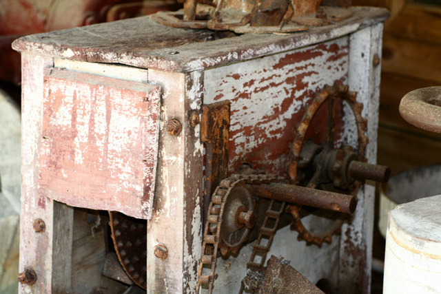
I actually kind of like the light in this image. I think it may have been a bit stronger from a lower perspective and closer in, but from the same angle. Of course, I'm usually a proponent of a tight crop. Get all the superfluous stuff out of the way.
The only other problem is the focus is a bit soft. Nothing for that but to keep a close eye on what's gonna be sharp. Don't feel bad, it happens.
A black and white conversion may be interesting as well, or a sepia duo-tone, to give it an "antique" look.
Actually I think there is some promise to the picture overall. But, yes, it does need some work.
1) It's soft. I didn't see which lens you were using, but we needed to either a) put it on a tripod if you were handholding at 1/60 or b) increase DOF (which would probably mean you needed a tripod anyway). You can see the gear in the front is sharper than the gear in back. Either way, they are both soft.
2) The interesting parts, the gears, are dark while the more boring part (the front) is light. Could we have moved or manipulated the object or the lighting to reverse this?
3) I would have cropped even tighter to remove the object on the right. Although some might complain, I may even cut off a small part of the big gear. That may lead to a my dynamic picture.
4) Many times in pictures that lack strong colors, changing to B&W is helpful. The picture then becomes one of texture, shape and pattern. You probably need to increase contrast too, although as is the front will blow out even more so you'd have to fix the lighting first.
For me, it's a little too bright on the left side and the focus seems to be perfect on the round thing that's half cut out of the frame on the right. I think if you had been able to get the focus on the 'olde geary thingy'*, it would've increase the score by at least a point or two.






 Add photograph to your favorites
 Add photographer to your favorites

 Photographer found comment helpful.


