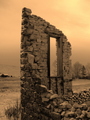
An interesting image. Your decision to keep the contrast subtle is thoughtful ... at first I thought it made the scene seem a little flat and two dimensional (with none of the revolting 'pop' so beloved at DPC). However, there's a lovely tonal progression starting from the foreground arch, then the upper arch, the lower arch, and finally to the lower rear wall. It establishes a pleasing gentle horizontal layering effect that would not have been possible with a high-contrast version. Sympathetic treatment of colour - subtle again! Title sucks, but I suppose you could hardly resist it. 8.
I like this image but it seems a little soft and flat. Maybe under different lighting conditions it would be more striking. I'd like to see some dark negative space and shadows. Not sure if this was possible.
Whoa!!! If that doesn't make old look beautiful I don't know what does! What a stunning, gorgeous old building! Makes me want to go there and get photographs like this!!!! 10







 Add photograph to your favorites
 Add photographer to your favorites

 Photographer found comment helpful.


