*Critique Club*
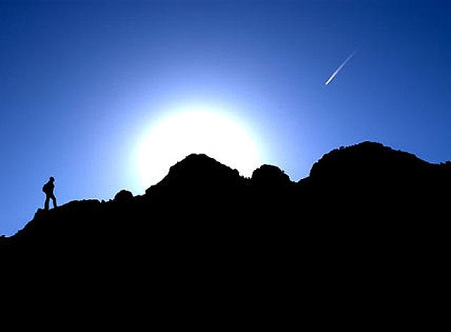
I really like the color here. The blue really stands out of the darkness of the silhouettes.
The angle and framing/cropping are good. I think that the placement of the shooting star is wonderful, as well as the sun. I think that you could have gotten away with less black at the bottom, but this ammount is not bad at all.
I am not really sure what the future aspect is. Maybe being able to see the sun and the shooting star at the same time? I supose since I'm not voting though, who really cares if I can see it or not. lol
The only thing that I can mention that might need improvement on is what has already been suggested, the compression artifacts. I think they effect this shot greatly in a bad way. Everything else is beautiful, and then there are these 'scars' throughout the whole shot.
Like I said though, the rest is wonderful. Great work.
~Heather~
Your photo quality here has suffered a lot. Everything has an outline of distortion on it that greatly distracts from the image. It looks like this shot is only 18k in size, so I'd definately recommend using a lot more of the available 150k by saving at a higher quality level. The overall image is pretty good. I like the silhoutte(sp?) idea, but I think the resulting shot is somewhat uninteresting. Perhaps if the "mountains" were on more of a grand scale it would add to the impact, as presently it looks like that person has a pretty simple and uneventful hike in front of him.
This is one of my favorite photos of the challenge. Not so much for its interpretation of the future, but because it is just beautiful to look at. The blue is so blue against the light and dark, and the shooting star is a perfect touch. Very nice.
Horrible JPEG-ing. Look around the entire edge of the land and the comet and the backpacker. Also - I've seen this shot somewhere before. This was posted elsewhere?






 Add photograph to your favorites
 Add photographer to your favorites

 Photographer found comment helpful.


