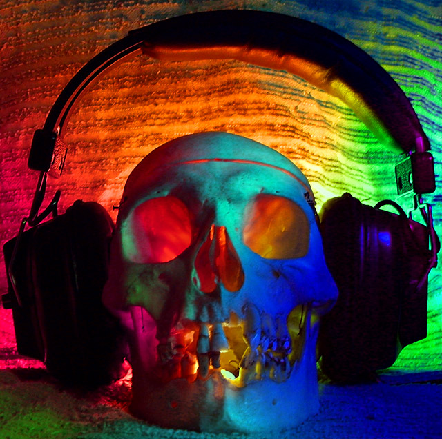
Well, not to beat a dead horse, but to me, also, does not convey "old"! Even the skull looks to be a Halloween decoration - rather than a real skull. Not saying it IS, just appears so, maybe due to the soft texture of your photo! Hope this helps a little, anyway!
As has been pointed out before, I think a little more attention to detail would have gone a long way to helping this image score better. While I like the concept, you could have hidden the light in the jaw a bit more, and the softness of a main subject, in this case the skull, is a score killer every time.
As far as the DNMC, well, that happens, don't let it deter you.
9.35 for concept, 4.95 for execution!
Wow...2 death references in one comment about a skull, that slays me!!!
For me this is too busy. The background needs work, you can see the lights in the skull and it is a tad OOF.
The lighting in the eye sockets is nice, and the colours are intersting, but attention to details would help this shot, IMHO
Way over the top, doesn't feel old, but actually very modern in it approach, even though the scull is old. Again, the "fluro" colors also make it feel modern, and again not old. This is a shame, as this is a great photo, but to me doesn't fit the challenge, re the modern approach/techniques used.....






 Add photograph to your favorites
 Add photographer to your favorites

 Photographer found comment helpful.


