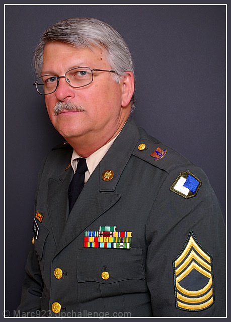
Too much shoulder to the camera---not enough head tilt--had he turned toward the camera a little and brought his chin around, would have been good---I also thing the background should have offered more contrast
If forced to quibble about something I'd want the BG just the tiniest bit lighter so his right sleeve stands out more. Even at this resolution I can make out the stitching in the embroidery and the patterns of the fabric and buttons; and that's an especially nice job positioning the glasses and eyes. I'm sure you'll both be proud to display a print of this : )
I think the hue is a bit off in this image. I think you tried to saturate the colors to bring them out more, but in doing so, he turned into the pink panther. If the skin were a skin tone I would have totally voted a 10 on this. Don't shoot yourself yet, it gets a solid 6 and one more because I like you.
This is a great colorful, sharp portrait but the negative space behind his head and his face being so close to the left side frame gives it an unbalanced feeling. This could quite possibly have been avoided by asking him to sit with a straighter back bringing his shoulders back and his head would move into the right hand side of the shot, as well as perhaps loosing the wrinkles where his neck meets his collar. In this shot it looks as if he is slouching a bit. Good luck.
Now, I call this is the picture perfect portrait. Wonderfully done portrait. It looks like the one put on the wall in General's office. This should end up in top 10.
Good lighting and the subject has a lot of character but it feel a little unbalanced to me maybe not enough negative space on the left not sure also he seems to be very close to the backdrop which has caused slight shadow.
There is a lot I like about this portrait. What I don't like is the dark background - it is too close to the color of the uniform. Perhaps toning down the pink a little would be good for his skin, too.
Love the choice in background. The face and the insignias really stand out because of it. I think I would have liked his face a little more centered. The pose is fine I'm just referring to the physical location of his face. Good luck!





 Add photograph to your favorites
 Add photographer to your favorites


 Photographer found comment helpful.


