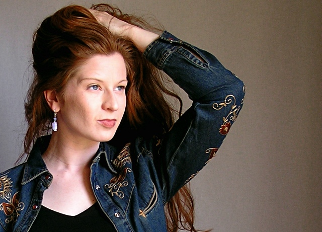
My best friend Adriane in my home studio. First "real" shots using my home made backdrops, lighting system, and diffusers.
PP:
rotate 90 degrees CW
levels (slight - but in each channel as well as value)
color balance (slight)
crop, scale, slight USM
hue/sat (slight)
save for web
Statistics
Place: 75 out of 199 Avg (all users): 5.7619 Avg (commenters): 5.8571 Avg (participants): 5.4234 Avg (non-participants): 5.9938 Views since voting: 1734 Views during voting: 452 Votes: 273 Comments: 8 Favorites: 1 (view)
In this picture I like the pose and composition in general, but there may be a little too much negative space on the right.
This could use a bit of sharpening I think. Especially on the eyes, left eye in particular.
Lighting is good, but not spectacular. One thing that i noticed in this challenge is that the top 10 all had their subjects looking directly at the camera, and thus the viewer. This really serves to create a connection between the viewer and the subject I think. The top 9 all had much closer crops than this, and great lighting and sharpness on the eyes.
I agree with the others that commented that there is a bit much noise, and the background, while being seemingly neutral, actually may distract with it's blandness. You may think about color coordinating with your subjects in the future.
Great color on the hair and eyes, not too keen on the BG though it's neutral enough and well enough set up and lit to not be a problem either. I used an off-center and partly dynamic pose myself, so I like that aspect as well : )
I like her pose and how you cropped/composed this. The background looks good although the left side has an odd coloration to it that doesn't match the hue of the right side at least not on my end.
Back to the model, I like how you stayed true with this shot (i.e. keeping some/all of the age lines in there). However I'm wondering if a slight compromise would have worked better. I'm thinking just a little bit of smoothing/lighting up on the cheek area so that her skin complexion balanced out better with the rest of her face. Since her cheek is darker and more contrasty the details stand out more which takes some of the focus away from her eyes, which look good.






 Add photograph to your favorites
 Add photographer to your favorites

 Photographer found comment helpful.


