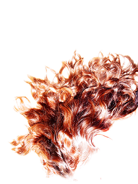
Some comments : It is hair (not a wig, not an animal!) and it's a shot of my wife, lying on a white board. About the right hand side truncation - that's where her shoulders are... I know a lot of people hated it, but it was required for the shot.
also the exposure - again required to 'white out' the skin of the face.
What kind of placement is this? Jeez. This photo got a 9 from me (can't believe I forgot to come back and comment on it). The only thing that kept it from being a 10 is that I wish that I could have seen just a *hint* more of her facial structure, but who cares, it is still an awesome photo and should be in the top rankings!
Very interesting. I like the white background, but I think it feels a little too chopped off on the far right. If more was cropped/framed out, it might feel intentional to me, because I think this picture would also look good with a wide left "margin" and "flowing" out of the frame on the right.
Very impressive photo. The simplicity of colors and the composition is superb. I'm pretty sure you gonna get a lot of comments about the "hair-cut" at the right edge. Well, here's another one: I like it! I think the subject would look kind of lost in the white space if it wasn't for the cut-off.
Honestly kinda tossed on this one. This is a really cool representation of fire. Some parts seem too bright, especially the background, but the hair effect is sooo cool. Extra cool points! 9 Swash
This is great. I think the title fits it exactly ;) I wish all her hair could have made it in the shot, and the few remains of the face still visible were gone. Either case this is a great photo. Good job. 8 cthenk
I'd have liked this better if it were the red hair on the completely white background, but if you'd done it without having to way overexpose the whole thing.
This is one that is probably much better than I can apprieciate. I'm bothered by things you probably did on purpose (and your probably the one that's right) but the way the hair is cut off on the right, the harsh near the bottom and all that wide open space at the top all hurt it for me. But that's a matter of taste. ~ Qyl 5
My daughter was viewing this with me and we thought it was flames when we saw the thumbnail. Then found out it was hair? right? I love the white space around this and the flamelike quality of her/his? hair.Gosh...I'm hoping I'm right on this and it's really hair...:P Pretty cool pic.. 8 - KDJohnson
Good idea, good composition, but two remarks : 1. why is it cropped on the right ? and 2. I don't like to over-exposure of the subject, texture would be better with a little less eposition IMHO
This is a really amazing picture, and the only thing I'm trying to figure out if I like is the pure-white highlights in the hair. If it wasn't necessary to make your whole background white, I'd tone down the highlights in her hair just a tad. They make parts of the image seem very harsh, where the flowing hair is very smooth and calming. The shapes and colors of her hair, though, really make for an outstanding, original shot. Nice job.
Very visually interesting. After staring at this for about 15 mins, i STILL can't decide wether I like it or not, but it's definately INTERESTING! I ended up giving you an 8 for showing more originality than most people for this challenge.







 Add photograph to your favorites
 Add photographer to your favorites


