Author Thread Comments Made During the Challenge
Post actions
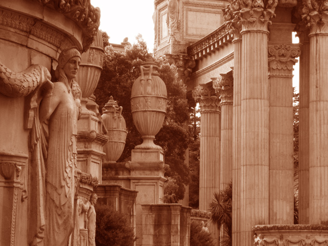
Doesn't seem like enough contrast
Post actions
don't like the colour. Though love the fine detail. I say a 9
Post actions
I'm not sure if I like the sepia on this. I'd love to see the color, with the tress contrasting with the pillars.
Post actions
For me, this would be better in regular black & white rather than the pinkish-red. Would love to see a bit darker midtones or increased contrast, too. Looks like a really interesting place!
Post actions
I think that this image wold of done well in collor 7
Post actions
Nice composition, however I don't like the orange tone on this. How would/did it look in contrasty black&white?
Post actions
I wonder if a black and white might have done this subject more justice? In any case, the cast is a bit on the reddish side for a sepia.
Post actions
It looks a bit flat. Early morning/late afternoon side light would have done miracles on these vertical textures. Nice shot anyway.





 Add photograph to your favorites
 Add photographer to your favorites


 Photographer found comment helpful.


