Challenge:The Future (Classic Editing*) Camera:Nikon Coolpix 5400 Location: Nottingham, London, London, London and London Date: Aug 5, 2003 Aperture: varies ISO: 50 and 100 Shutter: various Galleries:Rural, Digital Art Date Uploaded: Aug 5, 2003
Well now: kind of expecting to get voted down despite the specific 'no rules' stipulation, either by those who believe this goes against the spirit of the site, or those who haven't read them.
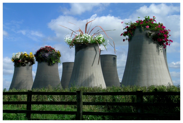
I've always thought that cooling towers would make great plant pots, and here's my chance to find out.
Tried a version with plants in the two background towers, but it becomes too confused - and in a bizarre way, too real. What I like here is that this is obviously edited, obviously concocted.
All edits performed in PSP8 - started with Photoshop elements because of the selection brush (not a feature of PSP), but it would crash my system every twenty minutes or so. The rearmost two sets of flowers are the most thoroughly mangled - desaturated, blurred, softened, and a process of airbrushing over and then softening that in an adjustment layer.
Shadow creation is on a duplicate layer, which is then reduced to 80% opacity to hide some of the errors and to blend the effect with real world stuff.
It's five images combined: the towers, the foregrouns plants and the fence are all one (slightly cropped, but otherwise unedited) shot. All images were shot deliberately for this challenge, apart from the flowers on the furthest tower, which are from an old image. Three of them are hanging baskets, and one is a pot in my girlfriend's garden. All the hanging baskets were outside pubs, whihc made the shooting experience more pleasant.
VERY interested to see how it does. Haven't felt this good about an idea since the Matrix ... fingers crossed.
Later ... I've now uploaded five revisions of this shot! Thank god the challenge closes tomorrow :-)
Statistics
Place: 2 out of 78 Avg (all users): 7.0201 Avg (commenters): 8.1000 Avg (participants): 7.0678 Avg (non-participants): 6.9889 Views since voting: 8253 Votes: 149 Comments: 51 Favorites: 26 (view)
Composition: I think the composition is great. I also like the fence. It gives the photo it's rural "setting" which makes your trick more plausible, because it really looks as if it's an abandoned nuclear power plant in the country. It also adds a perspective and depth to the image to see the fence in the foreground in relation to the towers in the background.
Lighting: Well, sunny weather is always nice. I see a good use of shadows. The lighting from the side creates shadows on the towers which make them look more plastic. This added depth again prevents the image from looking flat.
You also did a great job of adding the proper shadows of the flowers to the image. I think the lighting is the most difficult part of such fake photos. That's what decides whether the illusion is successfull or not. If the lighting looks out of place then people won't accept it. And to me it looks very real!
The only nitpicking thing I can find is the darker area in the lower right corner. It's not distrating or aother wise a big deal, but still I would like to see it being the same lighting as the other part of the fence.
Focus: I don't know what aperture you used for your "base" image of the fence+towers photo but it probably was a small one. The depth of field is very wide which is good because you really need everything in focus here. Normally photos tend to look a bit flat then but there are other things to prevent this (see above). The only noticeable focus issue I don't like is that some areas on the flowers on the two leftmost towers look a bit too soft. It seems they don't match the focus of the tower they're sitting on.
Challenge: You met the challenge very well. It's a great idea to convey this theme. It's something many people immediately understand. Personally I hope that this future will come true :) I'm sure this photo would work good as an advertising. It also would be a great poster for the election campaign of the greens!
Creativity: No question. This is really creative! First your matrix entry, now this. You really have great ideas! I knew why I added you to my favourite photographer list (already in april) ;-)
I look forward to your future photos. Good luck!
Stephan
Hi Ed, I have to say that this is my favorite. First of all, the PS work is seemless but I love the message and the irony. Beautifully composed. Oh, and the shadows! Brilliant. Congratulations on your placement.
I wish i'd kept a version with flowers in all the 'pots' - it was really too many flowers though, it became boring, and those empty ones are useful to make the fact of it's being a power station obvious. I almost entered a version with no flowers in the most leftward tower because of that.
I noticed during the week that the composition actually breaks most of the 'rules', which intrigues me: the most eye-catching flowers are dead centre image, although there is at least a parallel to the line of flowers in the fence (PaulK take note - that's why I used a shot with the fence).
Excellent concept, well executed with loads of social commment. Would have liked to see something in the far 'pots' too though. My favourite so far. A great future use of coolers so let's e-mail this suggestion to all the governments of the world! [9]
RIGHT ON!!! I was desperately hoping someone would embrace the idea of peace for the future, and you came up with a brilliant idea. I love it! Your photoshopping is flawless, too.
very nice digital art. i don't really like digital art though. but a good picture nonetheless. your shadow work on the reactors is really great. nice job
I don't like the fence in the foreground or the angle the shot was taken at or the fact the two cooling towers to the rear have no flowers however its still by far the best shot entered in the challenge
I was just browsing through, and not voting, when I found this. This is one of the most optomistic things I have seen in ages-- a guaranteed smile. 10.0 Would you release this photo for a non-profit use? I am volunteering with the Sustainable Living Foundation here in Melbourne, which holds a festival each year. I believe there is an artwork section, in which something like this would be perfect. You could get your name up, with a link to a website, I'm sure. Anyway, let me know...the festival is not until next February.
Nice montage. It made me smile. The whole image is tiny bit blurry and the lower right corner is a bit dark which distracts from the rest of the image. Otherwise nice.
Love this! What a great idea, and well executed. Very effective. Wish I could think of things like that. Minor gripe: the flowers seem to be a little out of focus.






 Imagine...
 Add photograph to your favorites
 Add photographer to your favorites

 Photographer found comment helpful.


