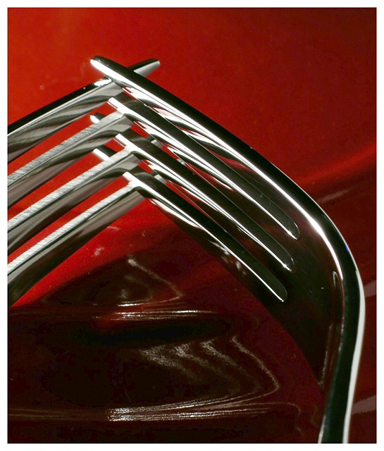
A development of a shot I took but didn't submit for the duotones challenge a while back (there was a version in my portfolio but I've removed it for the duration of this). Also thought I'd better take advantage of the 5400's fabulous colour rendition - though it's actuall pushed a little far here, there's some red colour channel clipping going on, but it isn't too noticeable i think, unless you've been told.
I hope the intersection of the tines counts as right-angles for everyone - on screen, only a few of them are, and I remember the difficulties over the symmetry challenge.
Pleased with: the colours (both the white and the red), the reflections, and the texture of the metal - it's a metal pan-lid by the way, actually from a Le Creuset casserole.
displeased with: dust specks, but they're so difficult to eradicate completely in shooting. Not actually tempted to clone them out - if it's good enough, I think people will allow it.
Lighting (the crucial bit). Same set up as a number of my studio shots. 40W bulb in ribbed anglepoise lamp, at low level out of frame left; two pieces of white card to right to provide a little fill, one of them with black stripes on it (it's just possible to make out the reflections of these in the left-hand fork).
Cropped a little, levels to lighten the mid-tones (a lot!), and a little un-sharp mask. The 5400's output is a touch soft, but I'd rather sort it in post than in-camera: more options.
Statistics
Place: 7 out of 250 Avg (all users): 6.4226 Avg (commenters): 8.0000 Avg (participants): 6.3150 Avg (non-participants): 6.5446 Views since voting: 2011 Votes: 239 Comments: 20 Favorites: 2 (view)
Seems like the critique club has become "passe" on dpc of late and I decided to chip in to get some done.
The photo did quite well in the challenge and I agree with what the commenters said were problems with composition. Not so much with the placement of the forks, I think that works quite well and creates an abstract quality to it. The only thing I would have said for you to do and I'm sure you know this but the lighting is not even. if there would be some way for you to tweak the lighting i little and make the backround an even red, you would truly have a winner on dpc. a very artsy photo, and a great job on the clarity of the forks. nice job again.
I really like this composition. The only thing that bothers me a litlte bit is the reflections between the two forks -- it is somewhat distracting, and I keep looking at them trying to figure out what is making the reflections look the way they do. But maybe that is a good thing, because I've stared at your photo a long time... 8
Challenging interpretation. It commends itself for continued scrutiny. The red background and the strong light from the left are impressive accompanists to the right angle that the forks create. I don't like the texture and shadow created in the red just below the juncture of the two forks nor am I crazy over the intense heat of the light off the topmost tine but all-in-all this was a creative idea and you pulled it off well. I'm interested to see how it does on DPC. My vote - 8
Reflections are beautiful. I wish that there was a tiny more bit of light near the bottom. There are some nice reflections and shadows happening there .
While I wouldn't dispute that you met the challenge, my eye is drawn more to the rounded part of the right fork than the right angles. I just don't feel right angles from this composition.
Technically I would suggest a slightly different DOF with the forks sharper and the background quite a bit softer. I like the lighting quite a bit, though if I were going to nit pick I'd like to get rid of the flare on the rounded part of the right fork (maybe that's why my eye goes there)
Beautiful image, great idea, strong colours and light, not sure on composition - the position of the forks in the frame doesn't feel quite right to me.






 Add photograph to your favorites
 Add photographer to your favorites

 Photographer found comment helpful.


