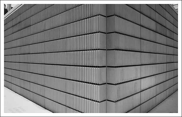
I think this photo could have been improved by seeing either the top or the bottom of the corner. Also the object (person?) in the top left corner is distracting. Otherwise a very nice photo, I like the b&w, the contrast, and the sharpness of this photo.
Like the receding horizontal lines in this as well as the opposing verticals. I think the strength of the dark horizontal lines will override my need for a slight improvment in the comp. The angles are superb.
interesting. i think I'd have liked to see you take the bottom of the pic right to the floor - i think it would have added some power to the shot. i really like the lines though.
Really meets the challenge. I wonder if it would be beter to have the middle be centered in the picture as well. so the left and right sides are symmetrical.
I like this composition. The leading lines lead right to the right angle. Would it have been better to get the right angle a bit more to the side to follow the rule of thirds?
Fantastic perspective. I would have either taken this pic lower or cropped the top more to get rid of those distracting corners at the top. Still very good tho - 9.






 Add photograph to your favorites
 Add photographer to your favorites


 Photographer found comment helpful.


