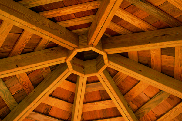
Lovely light on the wood, nice pattern.....HEY YOU KNOW THIS FONT IS BEGINNING TO KILL MY EYES SO I'M GOING TO ALL CAPS. I'M YELLING NOW BUT WON'T BE AFTER THE 3 DOTS...THERE IS ONE STRAIGHT DUET OF RAFTERS AND YOU MIGHT HAVE ROTATED AND CROPPED TO HAVE THAT ONE BIG RIGHT ANGLE IN THIS . ALSO MOVING THE FRAME WHILE SHOOTING....aah heck....the font just sucks period....can they change that? CAN THEY?.....you also might have shot left or right of center to improve the composition.....damn there go my eyes again..... (sorry about all that....coffee is coming....should help...but nothing is ever going to help this font!)
Composition is nice. Don't like the lighting coming from the bottom messes up the contrast. The light is giving it an orange hue. This may look very good in black & white. It would probably bring the shadow out more and give it more depth.
I finally found some right angles, but clearly they are not making the strength of this image. The strength is in the beams and the central hub, where no one can find a right angle anywhere -- wait, the boards themselves are rectangular, but certainly right angles are not poppin out at me.
While there are some right angles, I really dont thing this is the best example.. There are a LOT more non-right angles than there are right angles. It'd do good in an octagon challenge tho..





 Add photograph to your favorites
 Add photographer to your favorites


