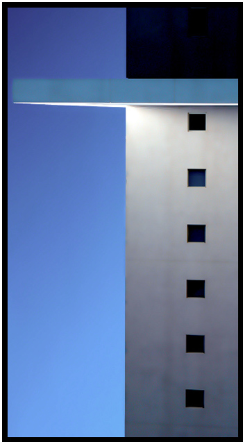
No way! This is the neatest picture. I don't know what that is, but it sure is cool. You've got sharp focus, colors are good, definitely interest, I rate it a 10.
The colors in this photo are amazingly crisp and I really like the fact that there are only right angles in this. I'm not sure what I'm looking at, but that doesn't really make a difference here. Great job!
Great clarity and expanse of tone. One of my favourite shots in this challenge. Yet...
I remain reserved about the composition, particularly the very narrow crop to the left of the light blue 'wing'. I would have preferred a more generous space, perhaps a 3rd of the distance between the windows, i.e. a measure relative to any 'given' in the photo, to suggest continuity.
The lighting too is questionable, since it is obviously natural, but reflects downward, off the 'wing'. I understand the choice for standing the image on end (to further enhance the abstraction suggested by the subject) but question the credibility of the resulting impression.
To render the image horizontally (wing up) would, IMO, achieve a satisfying effect, albeit a different one. I also miss a clear definition of the 'wing' against the sky, something that could, possibly,be achieved by sharpening the edges slightly. The double border is, IMO, more than is required to anchor the image in a page.
Regarless of these (perceived) flaws, the photo is powerful and beautiful, and I'm grateful for having the opportunity to 'sink my teeth into something' I can care about. :-)
Beautiful shot - my favourite this week! Very nice colour combination.
I really like the black windows and the dark upper part of the building which almost looks like a larger window. - 10





 Add photograph to your favorites
 Add photographer to your favorites


 Photographer found comment helpful.


