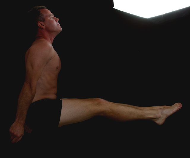
The bright area in the top right corner detracts attention from the 90 degree angle of the subject. Still, I scored this fairly high for its adherence to the directions while giving an organic feel - 7
I don't like the white patch at the top of the pic... it seems out of place. Plus the lighting on the person isn't to good. Creative however and does fit the challenge.
The only thing that bothers me about this picture is the light at the top. It draws my attention to it instead of the right angle with the man. Great work though. Wish I could hold a pose like that!
Composition = 9
Challenge = 10
Technical = 6
would have liked it better without the bright light in the upper right hand corner
Creativity = 8
X2 Wow factor = 8







 Add photograph to your favorites
 Add photographer to your favorites


