3rd challenge... I hope I do better this time.
This would've been my fourth, had I known about the daylight-saving thing. I don't have that where I come from.-_-"
Anyways, I had other shots I could've entered -- most of which are prettier and (I think) would've done better than this, scorewise.
I just like this one better. I don't know why.x_x
PP: color balance, levels, noise, crop, resize
Statistics
Place: 285 out of 396 Avg (all users): 4.7589 Avg (commenters): 3.0000 Avg (participants): 4.7353 Avg (non-participants): 4.7787 Views since voting: 675 Views during voting: 292 Votes: 224 Comments: 6 Favorites: 0
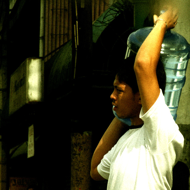
First Impression: The color and grain is the first thing I notice.
Composition: The framing of this is good and the negative space was used well.
Subject: A bit bland. We don't really identify with the subject because what you decided to include in the photo doesn't tell us much. Where is he at? Where is he going? That sort of thing. Also, half his face is not in view so we don't really get a good sense of his expression/emotion he may be experiencing. I know with my candid entry I made a similar mistake.
Technical (Colour and light): The color is good, which boosts interest. However, the lighting is a bit harsh. I think had this been a b/w image it probably would have felt more appropriate along with the grain. Speaking of which, the grain is probably a lot harder to pull off in a color photo than a b/w or sepia image.
Improvement: Include more "story" in the shot. If there was a shop nearby or a group of people in the direction he was walking including that would have helped tell a story. Even if those people had nothing to do with him it would place him in better context so we know a little more about this person's life and let imagination go from there.
Summary: A good take to the challenge. In terms of where this ranked, DPC tends to prefer cleaner images so the grain and the harsh light held this back probably more than anything else. However, don't take that to mean DPC voters are right voting this way. After all it's a site full of photographers who are very picky about certain things, which often times are just trival so just bare that in mind. The most important thing IMO is telling a good story with your photography and everything else is just secondary.
I'm not much for receiving or giving comments, but since Candids are
near and dear to my heart, I have decided to give comment on every entry
in this challenge.
This is very bad technically I'm afraid. Very grainy, and very dark where it counts yet blown out where the lighting does hit. There is unfortunately very little interest, very little emotion, and very little story. It's a 2 from me.
This is lovely and emotive image. The colors are really striking in their complement. Grain adds a lovely nostalgia to this as well. (I do want to note for you, assuming you don't know already, that "coolie" is an extremely offensive term in the U.S.....just in case all the low votes roll in on that account.)







 Add photograph to your favorites
 Add photographer to your favorites

 Photographer found comment helpful.


