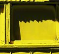
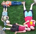
I really like your idea on this one. I feel like it might be a little over contrasted, loosing one of the important right angles in this image. Great idea though!
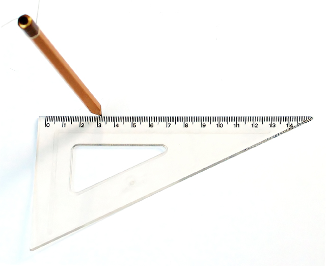
I like the concept here and like the high key brightness, but find it to be a little overexposed in the lower left corner. Also, I think you should have used white string to support the pencil to camoflouge it better.
Composition is o.k. The white of the picture is giving the photo a washout look. I think changing the lighting would be nice. I like how the pencil is standing. Maybe if the photo was done in b&w. I really like the way the shadow on the pencil was there , but wished that it had more contrast. A nice dark shadow maybe.
over exposed a bit....the shadow would have been great and another angle also needs a degree or rotation CCW. Also cropping a the top would have perhaps solved some focus problems with the pencil.





 Add photograph to your favorites
 Add photographer to your favorites


 Photographer found comment helpful.


