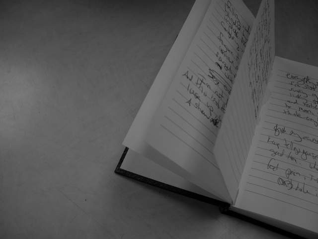
I like the composition and the idea, but the B&W needs a little bit of a levels adjustment I think. This is so grey -- it needs some differentiation between white and blacks and middle values.
This may not make sense, but I like the distance this picture has. I guess because it spills out of the top and left, so you can't really read what it is and the bw makes it seem moody. The viewer is there, but not there. he can see it, but can't experience it.
Don't know if it needs so much "blank" area to the left; I might have tried a vertical crop instead. Diagonal lines don't reproduce well, especially when resampled to low resolution and after JPEG compression.
there's a little pixelation visible, this is likely due to your very small file size (17k). try and use more of the allowed 150k. check out the tutorials (or PM me) if you need help. i like the composition with the note book only partially in the shot, and b&w is probably not a bad idea here, however, your shot is gray on gray. the pages should be white and you need more contrast. play with the levels in your photo processing software, even just using 'auto levels' makes a huge difference. -- gr8photos (4)
I think the negative space would have worked better if you pulled back to show the entire book in a corner of the frame. Also, the focus is off and there's a lot of jpeg compression due to the small file size.
I really like the framing of this shot, and I believe the soft blur is intentional -- but the jpeg compression is pretty noticable. I'd save this at higher quality. Good shot overall.







 Add photograph to your favorites
 Add photographer to your favorites


