*Critique Club*
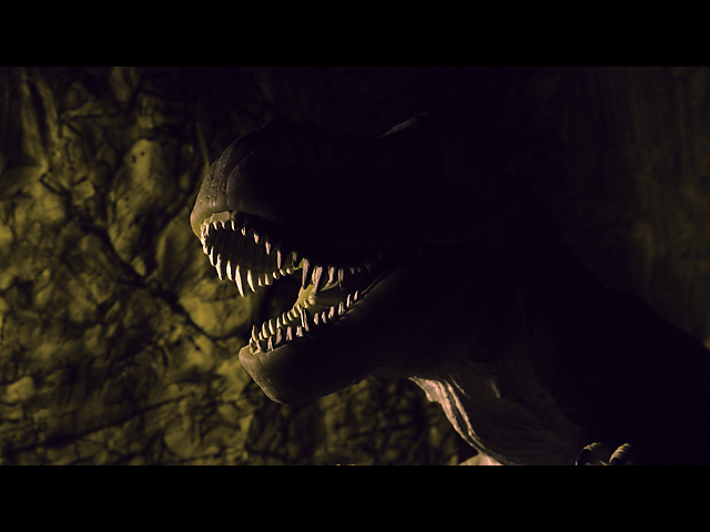
I really loved this the first time I saw it, and I still really love it. I don't think it's too dark at all. I think that the teeth just peeking out of the darkness is perfect. Maybe a little light for an eye would be cool, but I'm sure this wasn't exactly a piece of cake.
The focus is dead on. I really like how the background is blurred a bit and the focus on the dino is very crisp and sharp.
The lighting is wonderful. I think that it makes the photo.
Angle and framing/cropping are also great. I wonder though if there might be a little too much space on the right. As a photo, it seems unbalanced, however, it's not suposed to be a photo, it's suposed to be a movie, and maybe it works just fine as is.
Not really much more to say, I wish I could offer more in the way of improvement, but I really do like it as is. Even with the bonus time I get to spend with this shot, I believe it's still a 10 from me.
Great job. ~Heather~
a little more light on T Rex would have made a better impact. The right side of the photo is too dark IMO. The composition is good and I like the colors.
Really like where you were headed with this just wish you could have just picked up bit of glint / highlight in its eye, not sure if it the monitor, in the office, the right side is really very dark would have liked to see a little more of his neck very sublty seperation from backgound but again it could be the monitor.
This is perfect. I really really love the execution here. The focus and clarity are awesome. Great crispness on those teeth. The lighting is perfect for a mysterious creepy shot. I think that this represents the movie well. It's even in widescreen. lol. The angle and framing/cropping are excellent. Background is perfect as well. I tink that this is a 10 from me. Good luck in the challenge. ~Heather~
Nicely lit, good dof, interesting composition. However, I think you either needed more detail in the rest of the shot other than the teeth, or less detail. As it is, it doesn't look deliberate enough. I think you could have done with a little less negative space to the left... or right, either would have done! 7
I like the black "widescreen" bars. a nice idea. Also a good image. I think the lighitng is effectively dramatic, but it would be awesome with a glowing eye! 7





 Add photograph to your favorites
 Add photographer to your favorites

 Photographer found comment helpful.


