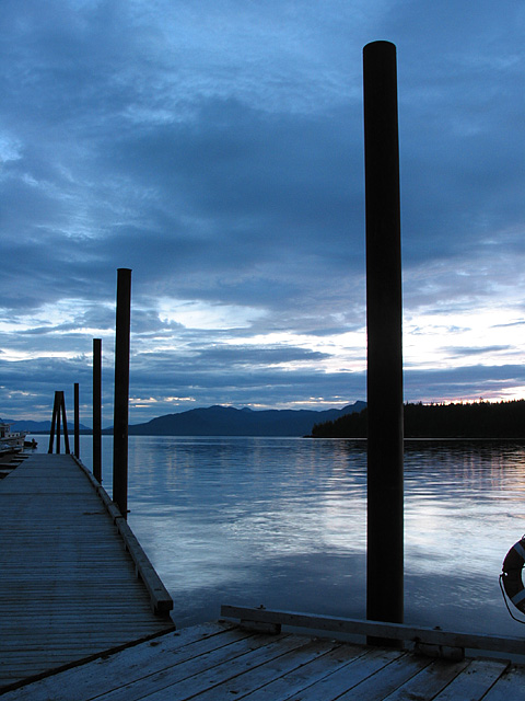
Nice image. Love the poles' silhouettes and the touch of definition to the pier. Kind of wish there was either a little bit more color in the sky from the sunset to add some other colors, or a little less to make it all blue. The only thing I really find my eye repeatedly going back to in a bad way is the life-preserver. I don't know what you'd do with it though -- crop it out and you're too close to the pole, put it in and you lose the nice composition you have.
It would have loked better, inmho, if you cropped off the top one and a half inches to force the eyes to look further down the dock, see what we're missing at the top of that first one. Know what i mean? Try it. good job though.
EXCELLENT! I am fascinated with the coloring in this photo - it is just perfect. I sense a little sadness, but at the same time relaxation. It has a calming effect. Great photography!! Ruthann
I do wish you had croped out most of the sky. It would not hurt to let the nearest post go beyond the fram. Center of focus would be the water and skyline. aelith
I love photos of docks like this, I have one I took that yours reminded me of - the softness and the quietness - a picture of what peace could look like - I wish that piece of life preserver wasn't in it, but I'm sure you do to. I'm sure you've gotten 'it's too dark' but I like it. good job. 8 cthenk
I REALLY like this image. The mood here is excellent. The only critique i have is that the partial ring float in the lower right is a bit out of place. I believe that taking about one step to the left and one step forward would have removed the ring float and also hidden the boats on the far left edge... good work! = 8 - jmsetzler
far right pole is too dominant; cropping it and eliminating the pole might improve the composition even if you lose the sunlight shot; a good photoshop session would take that out -
i really like these kind of shots, the pier on the left with the poles is great, too. the cut-off life-saver on the right bothers me though, i tried recropping this photo to 640x427 (the other allowed format on this site) and liked it much better. just something to consider ... -- gr8photos (6)
beautiful colors, I would have moved the camera more to the left, get that life tube thingie out of the shot as well as push that pole more to the right. :) 6
The lifesaver needs to be in or out but not both. I'm thinking a angle down the pier would work great ! I love the calm feel of this and the blue tones.
This is one I would hang on the wall. Great job. I would crop out the life preserver on the right of the image ... and maybe get a guy in a boat or even a nice bird ... but somethings you cant control! Def a 9.






 Add photograph to your favorites
 Add photographer to your favorites


