Challenge:Movies (Classic Editing) Camera:Sony Mavica CD400 Location: Home Date: Aug 3, 2003 Aperture: auto ISO: auto Shutter: auto Date Uploaded: Aug 3, 2003
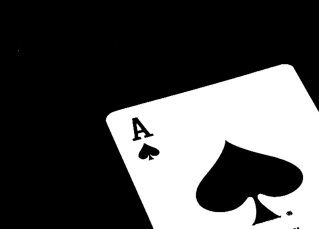
Something about this looks . . . odd or displeasing to my eye. I think its the lines in the A at the top of the card and the line of the top of the card. They seem serated. I think the idea is good and the composition is good. But with just the black and white, these non-crisp lines drew me to look into the lines of the picture more than the actual shot. Hopefully that's just me. - 6
I like this..though I think the movie had a more rustic, old fashioned/old west stye, and the editting of this seems very stark and modern. Bit of a disconnect.
The picture is a little fuzzy to me. I would have laid out some poker chips or somthing to grab the eye a little better. There is a little white spot in the black background, Very distracting. (6)
I love it... Simple, but really love your composition and the contrast between colours... I will only change a thing.... You cut one thing of the card in the left top, but there is not important. Congrats, it´s a goo job... 8
Shame that the edges here are so badly aliased... I wonder what adjustments you did to this pic to cause it! Great composition otherwise. 4 (yep, the aliasing really spoilt it for me!)
Very nice use of black and white in the composition. There's a tiny spot in the top left hand corner (a stuck pixel?) that should be cloned out. Also, if this were mine, I'd clone out the two black dots showing on the bottom frame below the ace. They tend to draw the eye to themselves and so are a bit distracting.
You are showing some pixelation. Though my shots are bad to do that at this size with diagonal lines, your file size is showing less than 25KB, so I am wondering if it is compression artifacts.






 Add photograph to your favorites
 Add photographer to your favorites


 Photographer found comment helpful.


